
Matt Ziminski
Recent BS/MS in CS Graduate from University of Illinois Chicago
Recent BS/MS in CS Graduate from University of Illinois Chicago
This is my first CS 424, Data Analysis and Visualization, project. It's goal is to be able to visualize the data (linked below) and formatted into a CSV by my Professor, Dr. Andy Johnson. This project uses R as the main language, the following packages (shiny, shinydashboard, reshape2, leaflet, ggplot2, DT, usmap) to preprocess, manipulate, and plot the data, RStudio as the main development environment, and ShinyApps.io as the prefered location for the deployment of the app.
To start off, please click on the cloud icon at the end of thhis page and it will take you to ShinyApps.io, where this app is deployed. Once there, you'll be presented with the main dashboard, and objective 1 of the project.
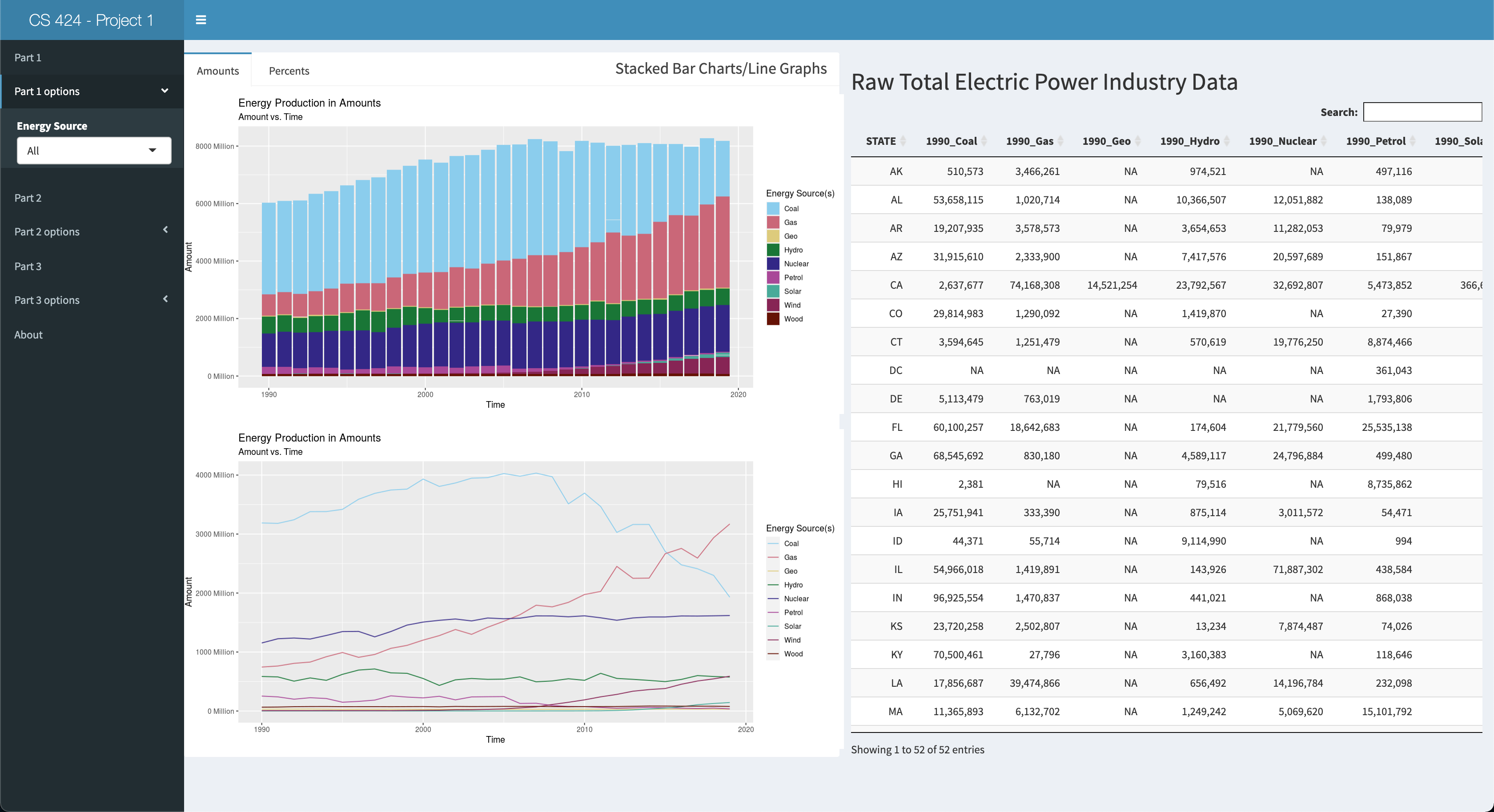
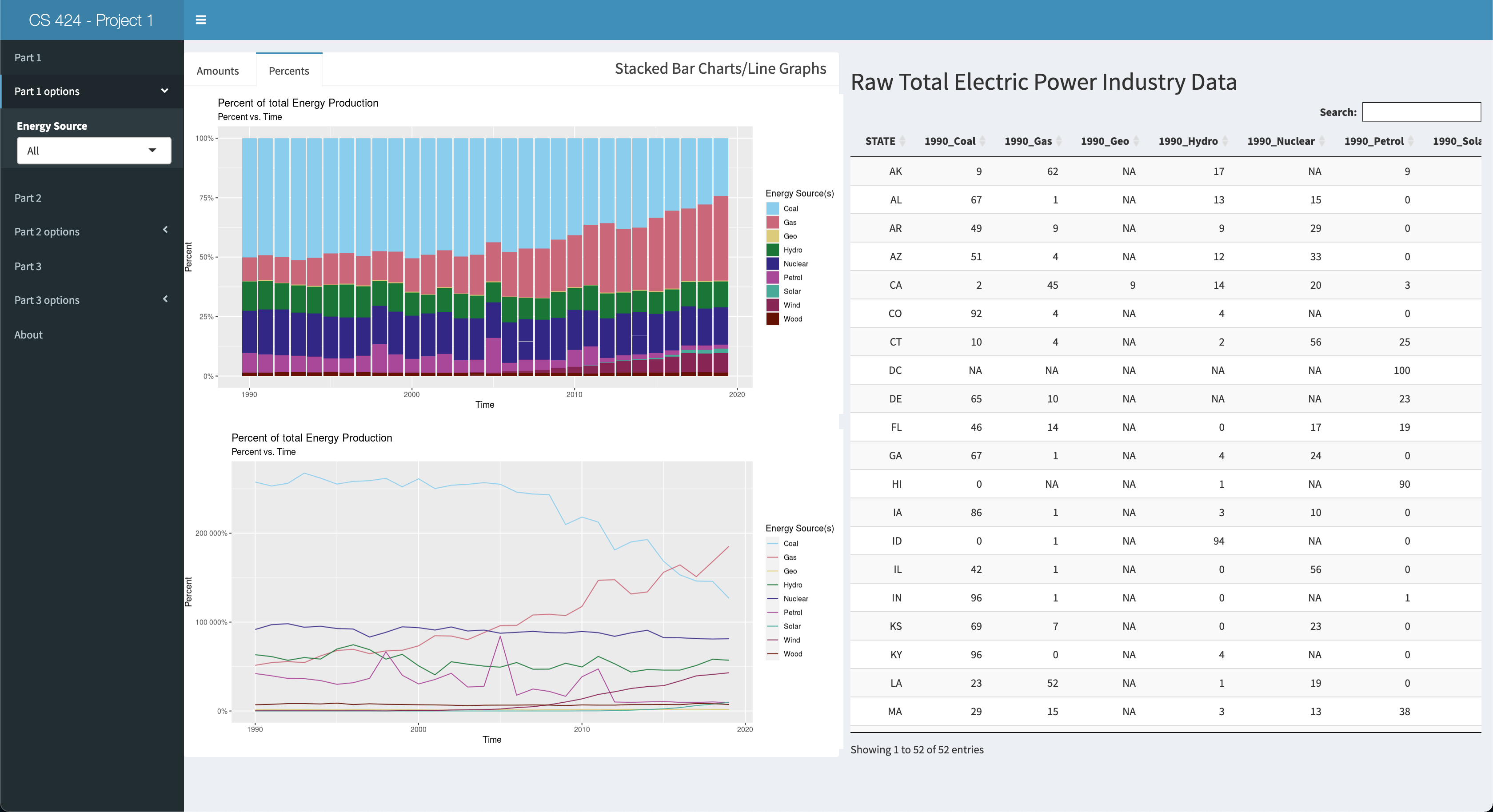
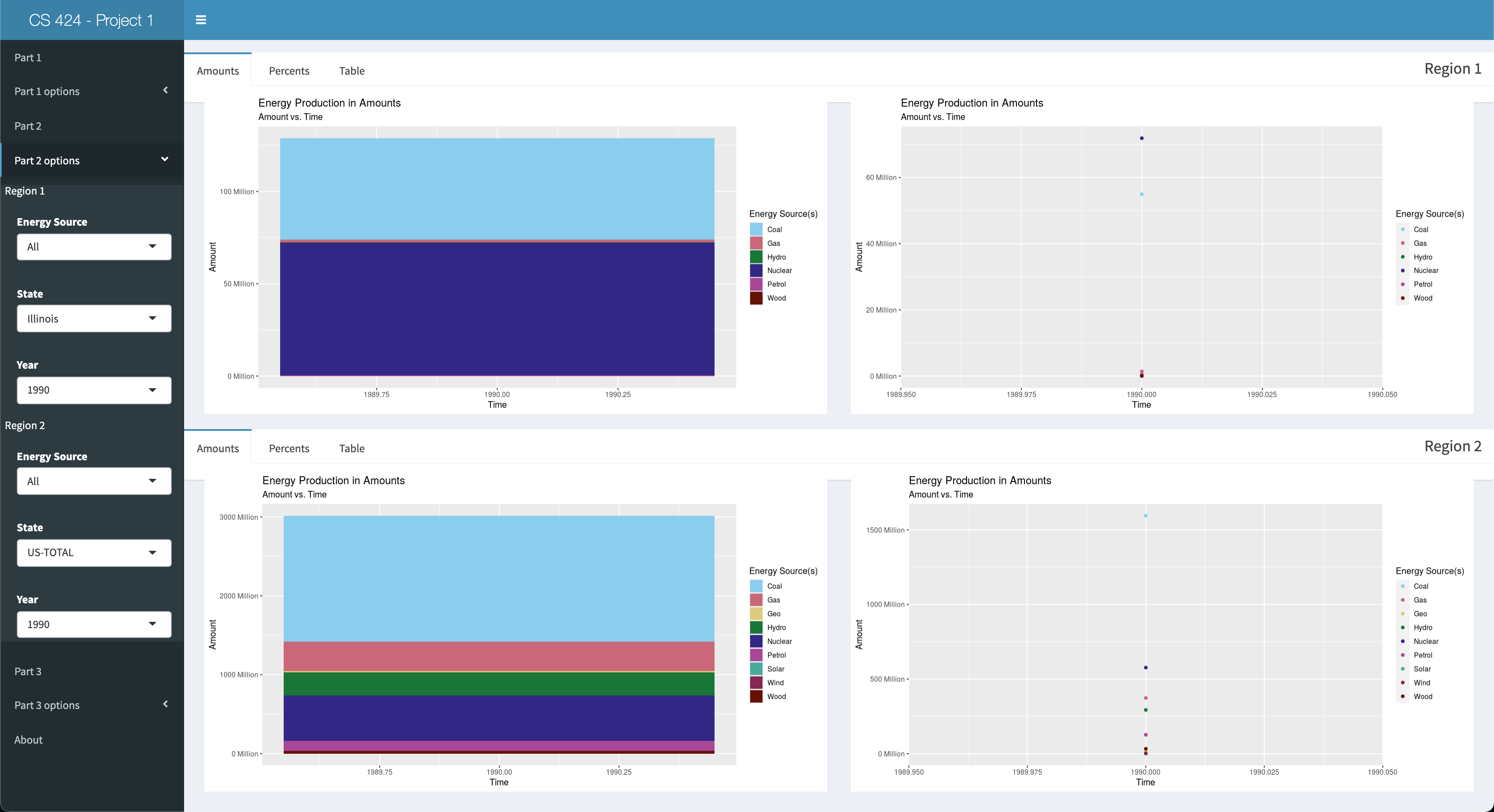
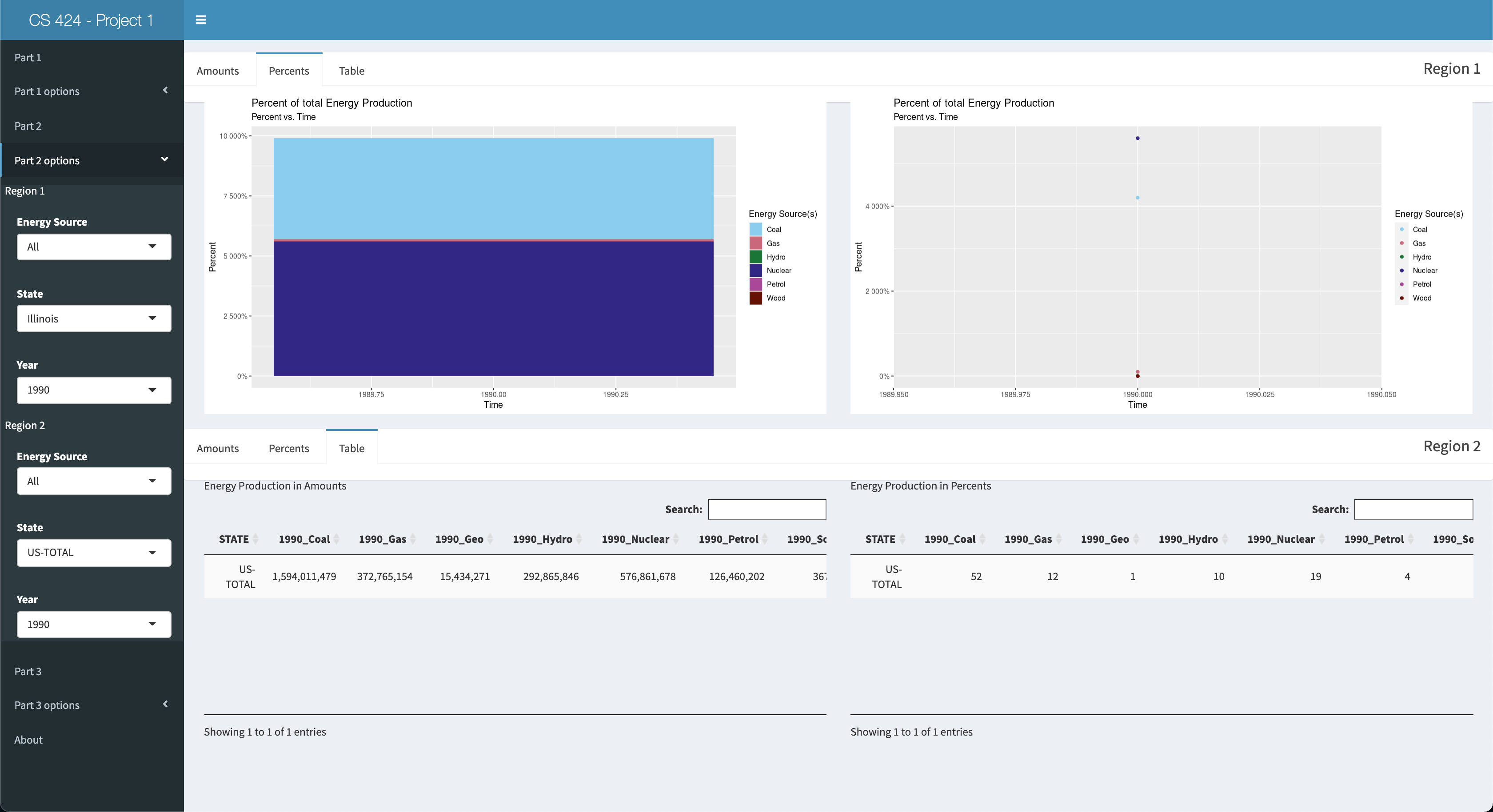
Viewing Objective 1: Here you can view the amounts of all the energy sources present in the dataset in 3 ways: 1 stacked bar char, 1 line graph, aand the table on the right side of the screen. You can also click on the "Percents" tab of the pane to view the total energy production of any given energy source for that year as a bar chart an as a line graph. Also, the table will update so you can view the calculated percents in tabular form. Lastly, in the side panel you can click on part 1 options to select which Energy Source you'd like to see in the visualizations in the main pane. Now moving onto objective 2.
Viewing Objective 2: First click on the "Part 2" left-side-panel-tab item, and then click the "Part 2 options" tab to open up the options for this objective. You should be presented with 2 split panes. The top pane is named "Region 1" and the bottom pane is named "Region 2." These 2 panes will serve as your means to compare two different "regions" of data you select. However, the default values have already been set, so you'll see Illinois data in the top pane and US-TOTAL data in the bottom pane. Each pane will have a tab bar to switch between the amount, percents, and tabular representations of each region data. Finanly, you can change the values for the Energy Source, State, and Year for the respective region in the left side panel, within part 2 options. Now let's move on to objective 3.
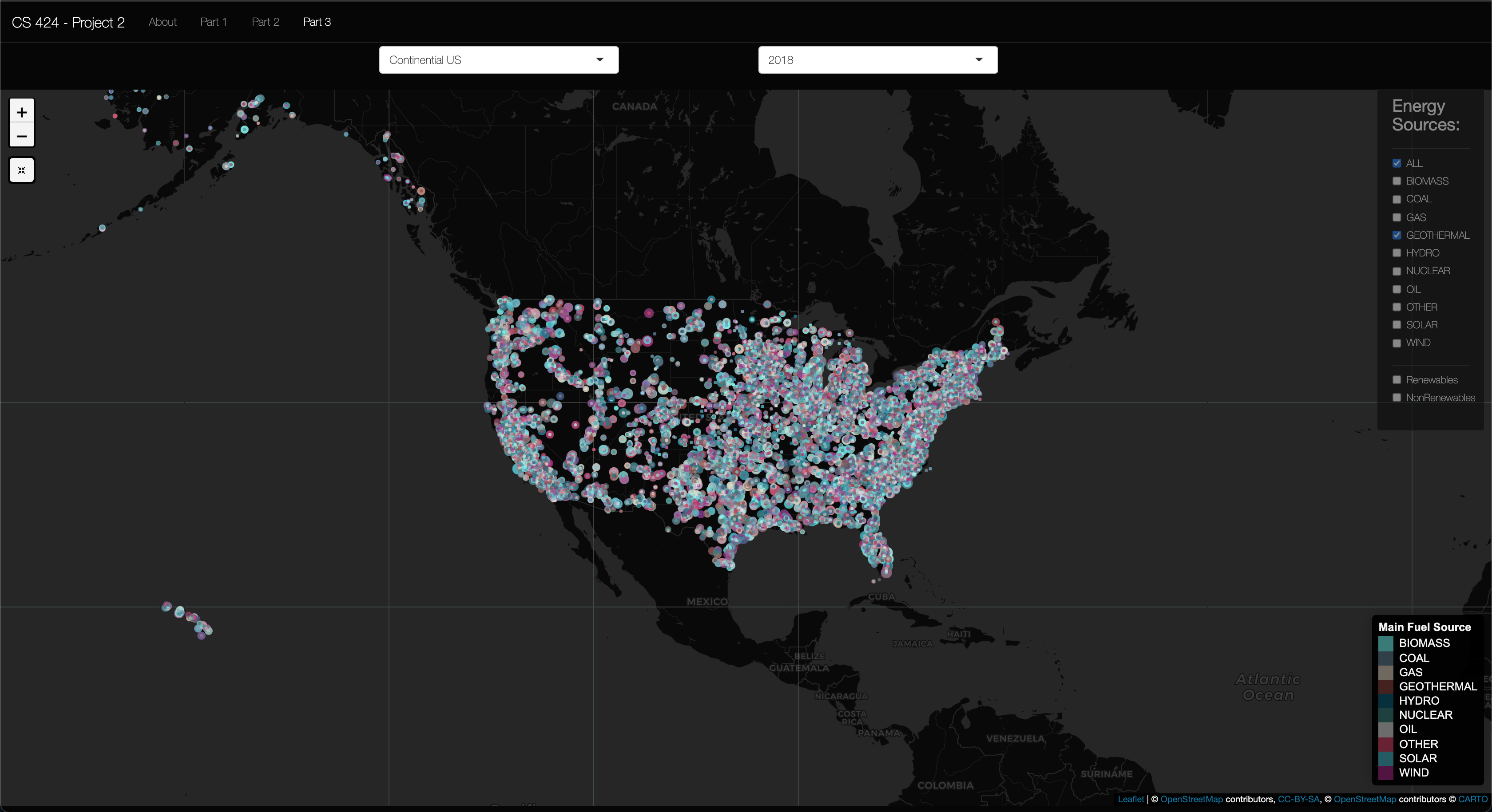
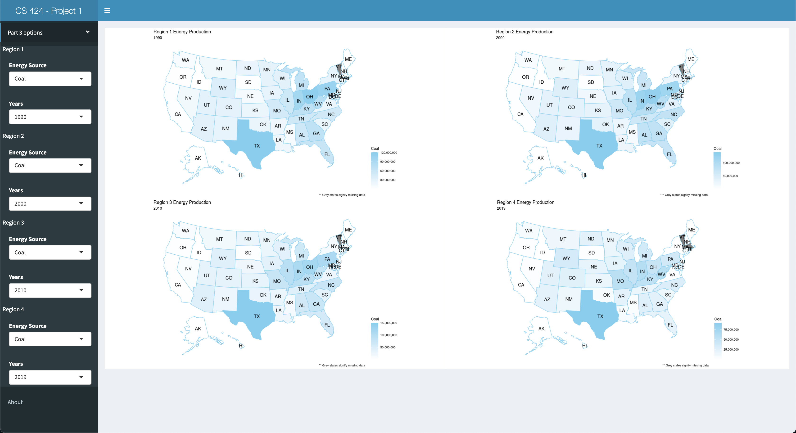
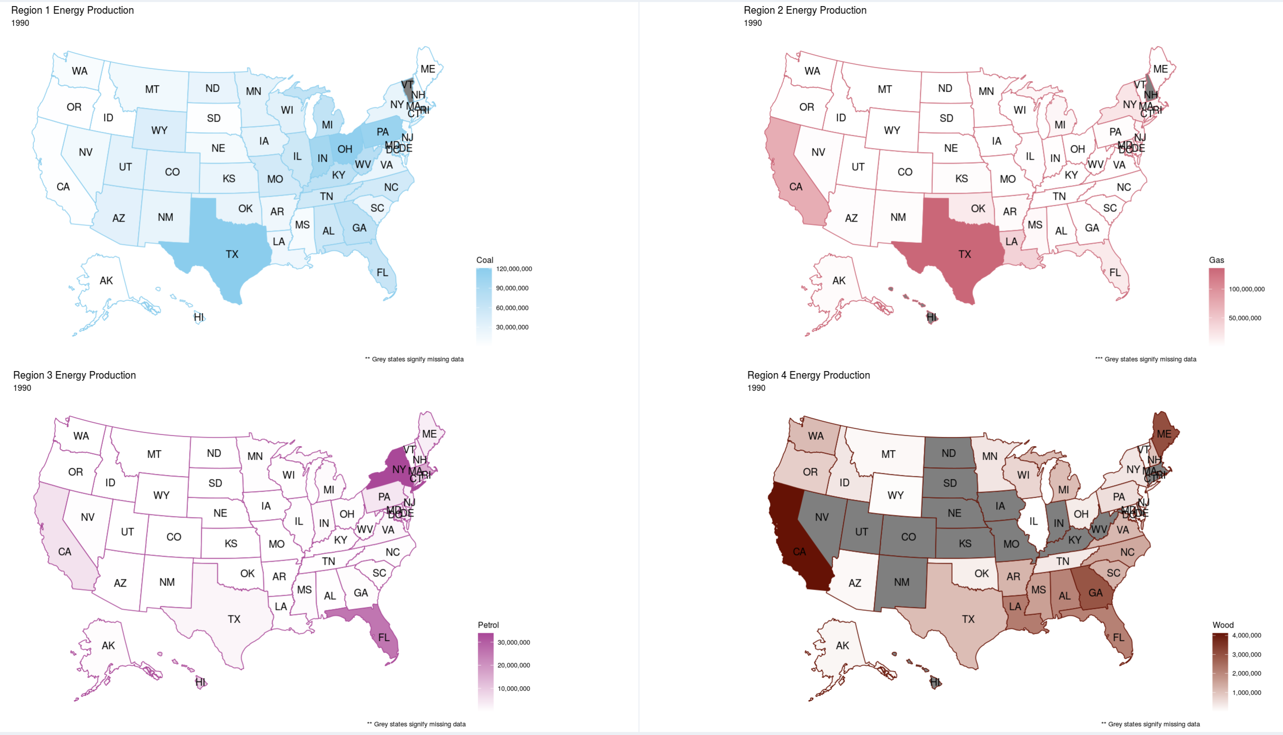
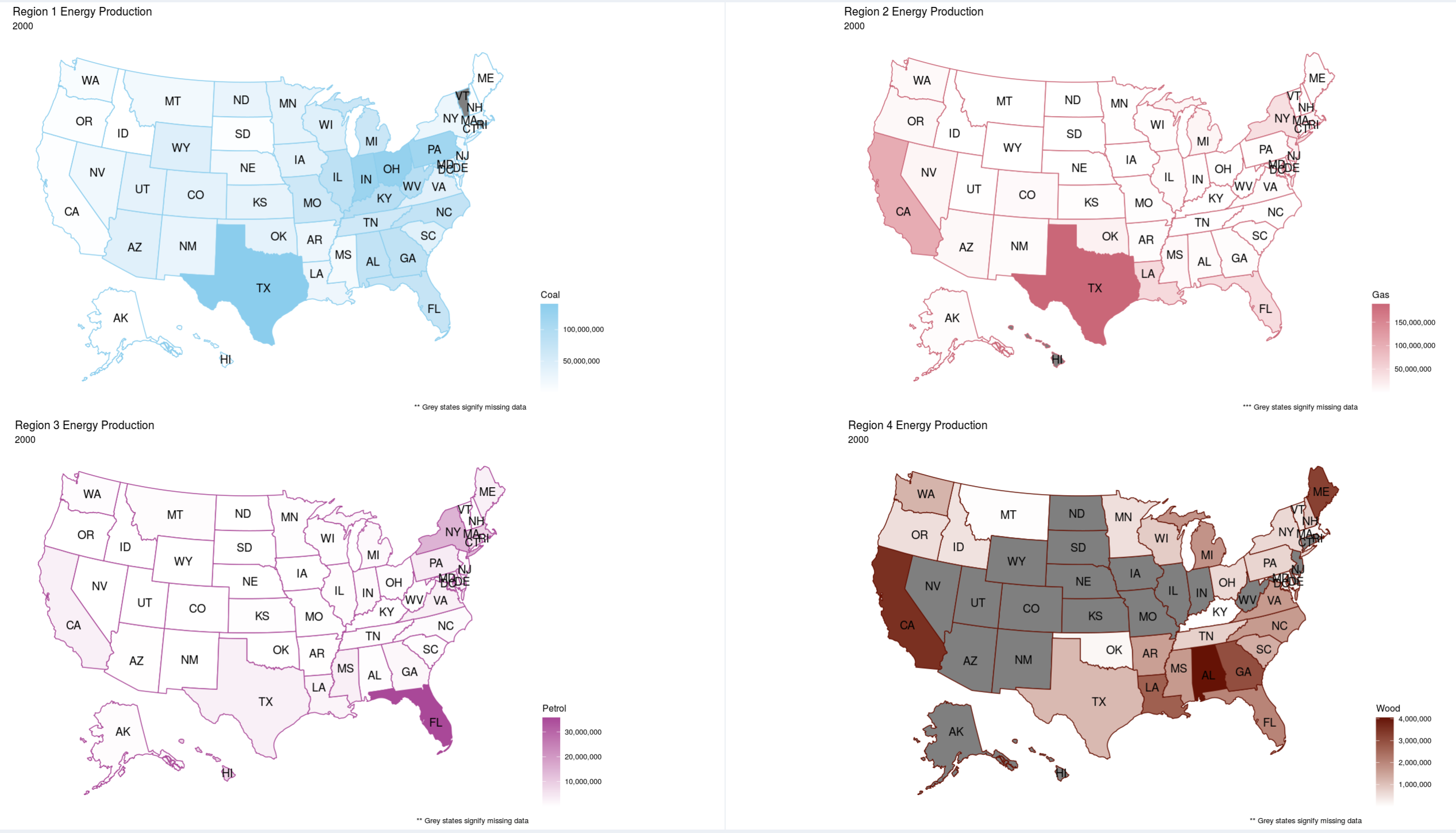
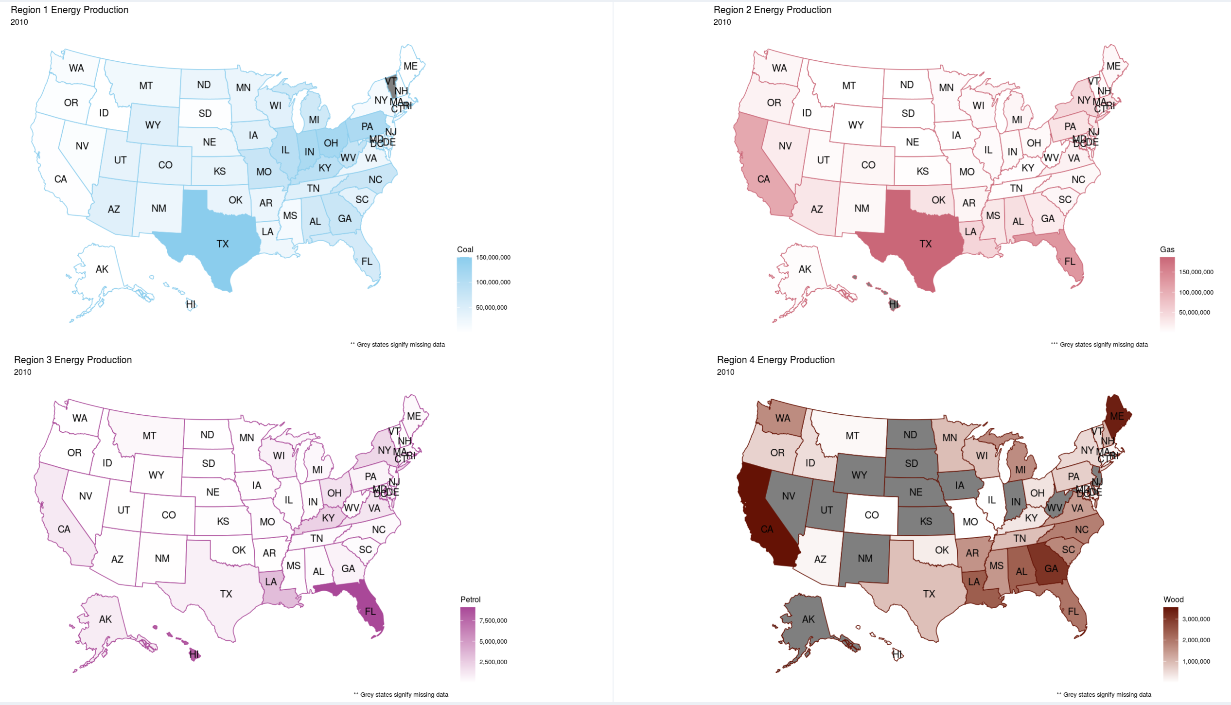
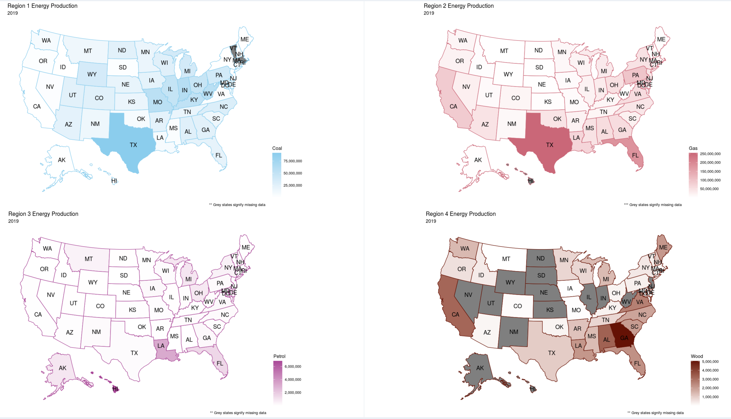
Viewing Objective 3: First click on the "Part 3" left-side-panel-tab item, and click on the "Part 3 Options" tab to open up the option for this objective. You should be presented with 4 headmap plots showing 4 different data regions to compare against. The default settings for this objective is having "Coal" as the energy source and the years 1990, 2000, 2010, and 2019 selected. However you can select any energy source and year to compare against in any of the 4 U.S. heatmap plots. So go wild and see what you can discover in the data, here and/or the other parts. And now for some "bonus" content.
Bonus Content: To view the bonus content, click on the "About" tab in the left-side panel-tab. Here, you can see the credits/attributes for this project, and a another, but short, discription of the project.
Post Script: If you're interested in running the code yourself please click on the 1st link found at the botton of this page for the detailed description found on my GitHub Repository project page.
As mentioned above I got the data from eia.gov, and the link to the data set is at the bottom. However, I downloaded the CSV file my Professor created for this project. So, before I could plot this data I had to preprocess it. First I read the CSV file into RStudio as a table. I then renamed the columns with a better format as the format that was the rusult of the CSV file read was annoying to me. I then set the type of the GENERATION column to be numeric and I formatted the numbers to not include the comma seperators. I then filtered out the data to only include the "Total Electric Power Industry" as the Type of Producer. In the STATE column there were 2 formattings for "US-TOTAL" the latter and "US-Total" so I just uppercased any instance of "US-Total" to get "US-TOTAL." I also, set the column type for State and Energy Source to an R Language factor type. This type makes data manipulations easier than when they'd be their original character state when plotting the data. Next I removed the 3 misslabeled rows and I removed any instance of a negative number in the GENERTION column. I then removed any instance of the word "Other" and phrase "Pumped Storage" in the ENERGY Source Column. I then converted the table into the wide format, and made a new table to store the percentage of the total energy source produced in a given year. Using a wide table made it easier to calculate the percentages, and once I did that I converted the wide table to a long table for easier plotting, but I kept the wide format for the tabular representation fo the data. And that's how I preprocessed the data for this project.
If you want to use the CSV data file for your own project you can go to my GithHub Project page, linked below, to download it.
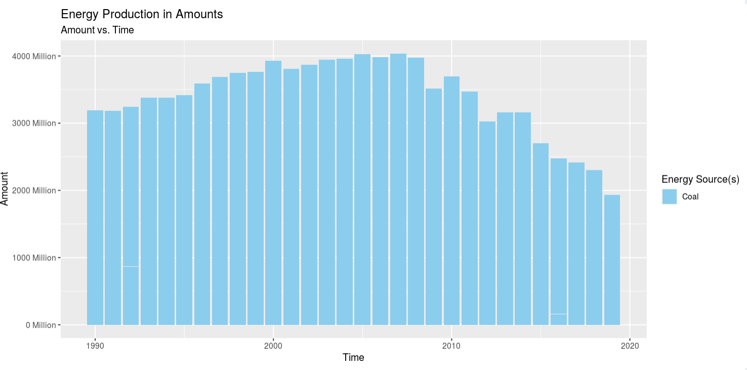
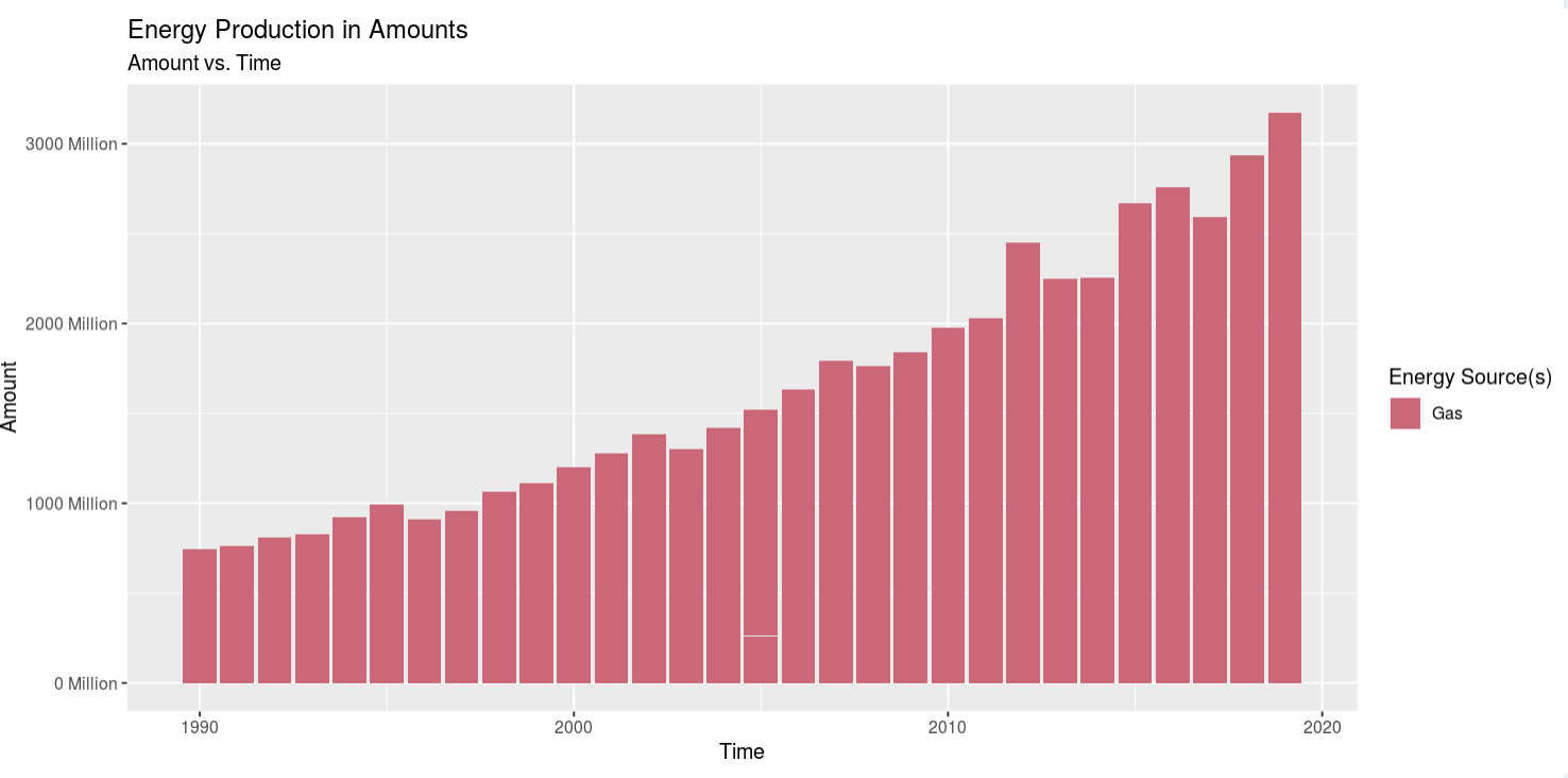
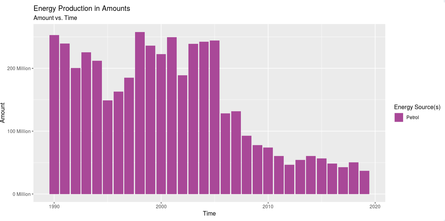
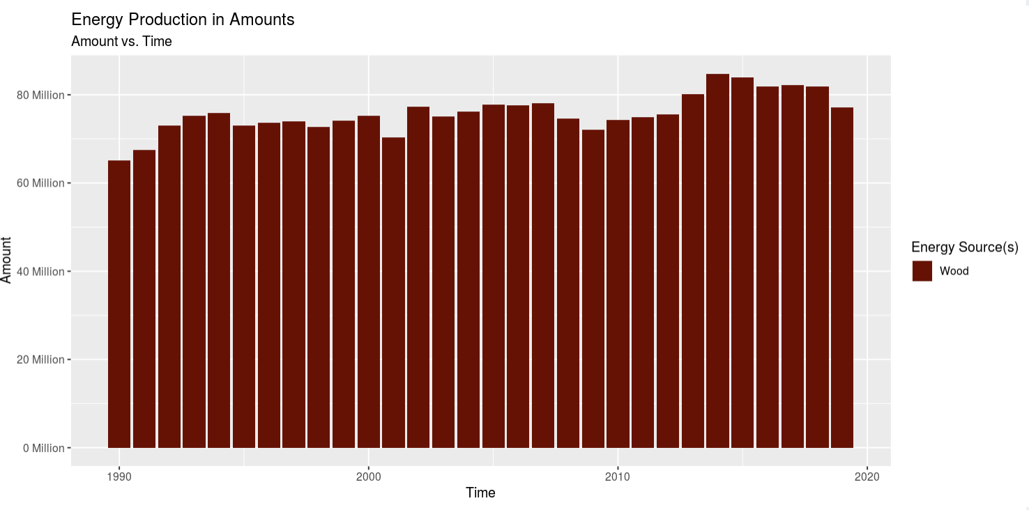
Insight 1: Looking at all the energy sources at once was easy to see a trend on increasing energy production, but it was kind of hard to see their independent trends. So I selected looking at Coal, Gas, Petrol, and Wood. Coal is on a stead decline after 2010. Gas is on a steady/quick rise. Petrol was on a quick decline after about 2008, but it leveled off. And wood energy production has seen a steady, but slow, increase. The trend for coal and oil was expected as what I've heard and/or read from the news i the past match my prior assumptions, but the increase in gas usage shocked me, and so did the slow but steady increase in wood usage. I didn't expect to see gas on the rise, but then I think it's the "cleaner" alternative to using coal to produce electricity at power plants. However, using wood to generate power in this day and age really threw me off. I would've expected for wood use to be low and coal/gas/petrol to be high, but coal and petrol are on the decline and gas and wood are on the incline, so I'm a bit confused as to why that is. My only assumption for why wood use is moderate is because it's might be cheaper in certain areas of the country than ohers or maybe theres an abbundance and it needs to be burned off quickly.
Insight 2: Then looking at the heatmaps of Coal, Gas, Petrol, and Wood, I found out another interesting insight relating to the geographic distribution of them. The Coal heatmap stayed relitivly constant, appart from the fact that 2 states had no data for the heatmap in 2019. Gas usage stayed relitivly constant in Texas, but decreased in California and increased in Floridia. Petrol seemed to "migrate" from the East coast and Flordida to Lousiana. And wood had a lot of fluctuations, as many states moved from having data to show to having no data to show between 1990 and 2019. And lastly, the wood usage seemed to jump from California, to Alabama, then to Georgia, and in 2019 when Georgia had a high count the East-coast lightened up.
1st link: this will lead you to my GitHub Repository for this project.
2nd link: this will lead you to the homepage for the unprocessed dataset used for this project.
3rd link: this will lead you to the ShinyApps.io dashboard I made to visualize the dataset.
4th link: this will lead you to a YouTube narriated walkthrough of how to use the ShinyApps.io dashboard.
This is my second CS 424, Data Analysis and Visualization, project. It's goal is to be able to visualize the data (linked below) using the R Leaflet package. This package produces a tiled map like google maps, of the data you provide it. Then to reiterate, this project uses R as the main language with the following packages (shiny, shinydashboard, reshape2, leaflet, DT) to preprocess, manipulate, and plot the data. RStudio is used as the main development environment, with ShinyApps.io as the prefered location for the deployment of the app.
To start off, please click on the cloud icon at the end of thhis page and it will take you to ShinyApps.io, where this app is deployed. Once there, you'll be presented with the about page. Here you'll get a basic description of the project, any attributes and my contribution to it. Next hit the part 1 tab.
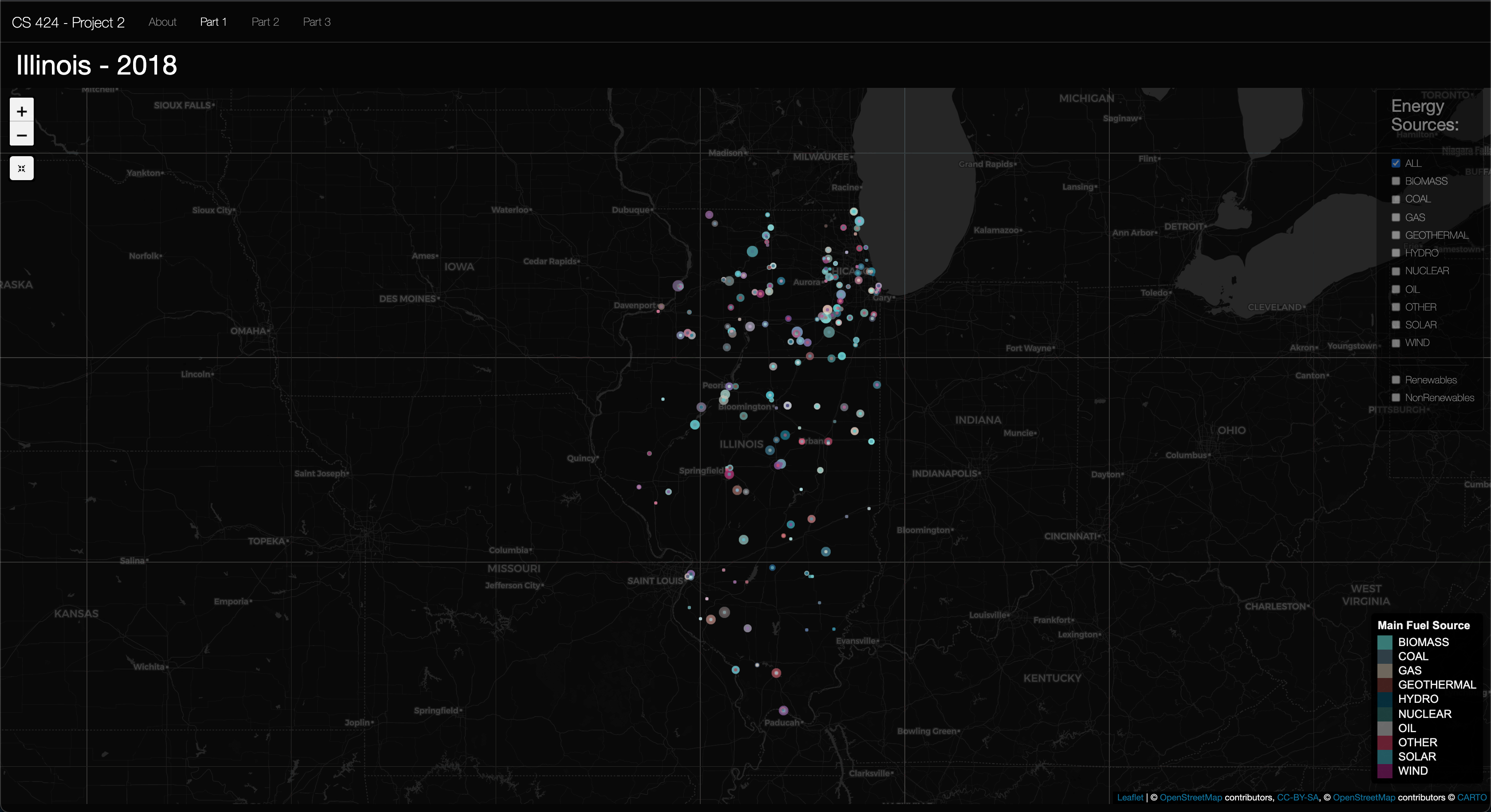
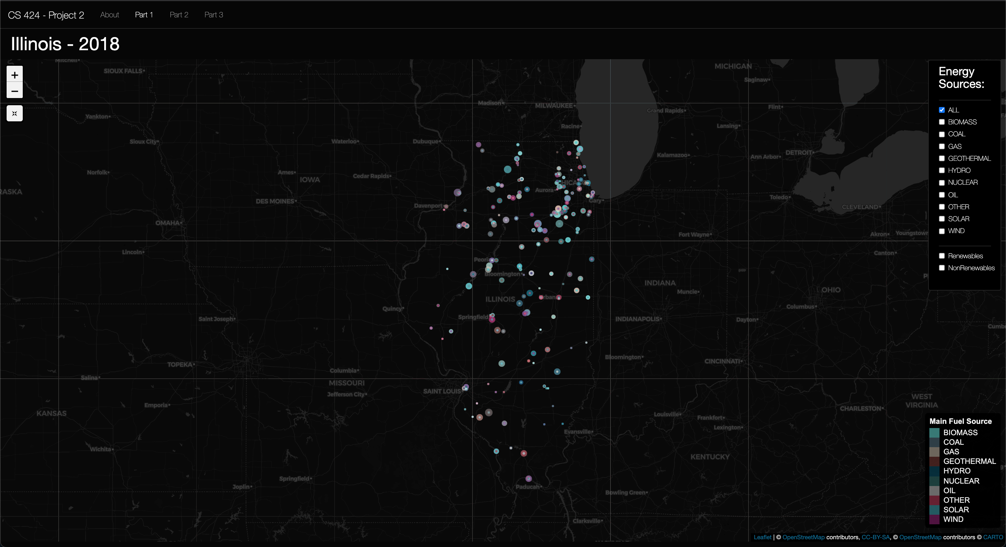
Viewing Objective 1: Here you'll see the map zoomed in to Illinois. The legend showing each energy source color can be found in the bottom right. Then at the top right the Check box pane is located and is transparent by default, but when you hover your mouse over it it becomes opaque. So it's easy to see when you need it, and it has a less of a presence when you don't need it. And to the top right corner is home to the zoom buttons, plus and minus, and the map reset button, which reset to the original sttatte that the map was loaded in. Moving on to object 2 now...
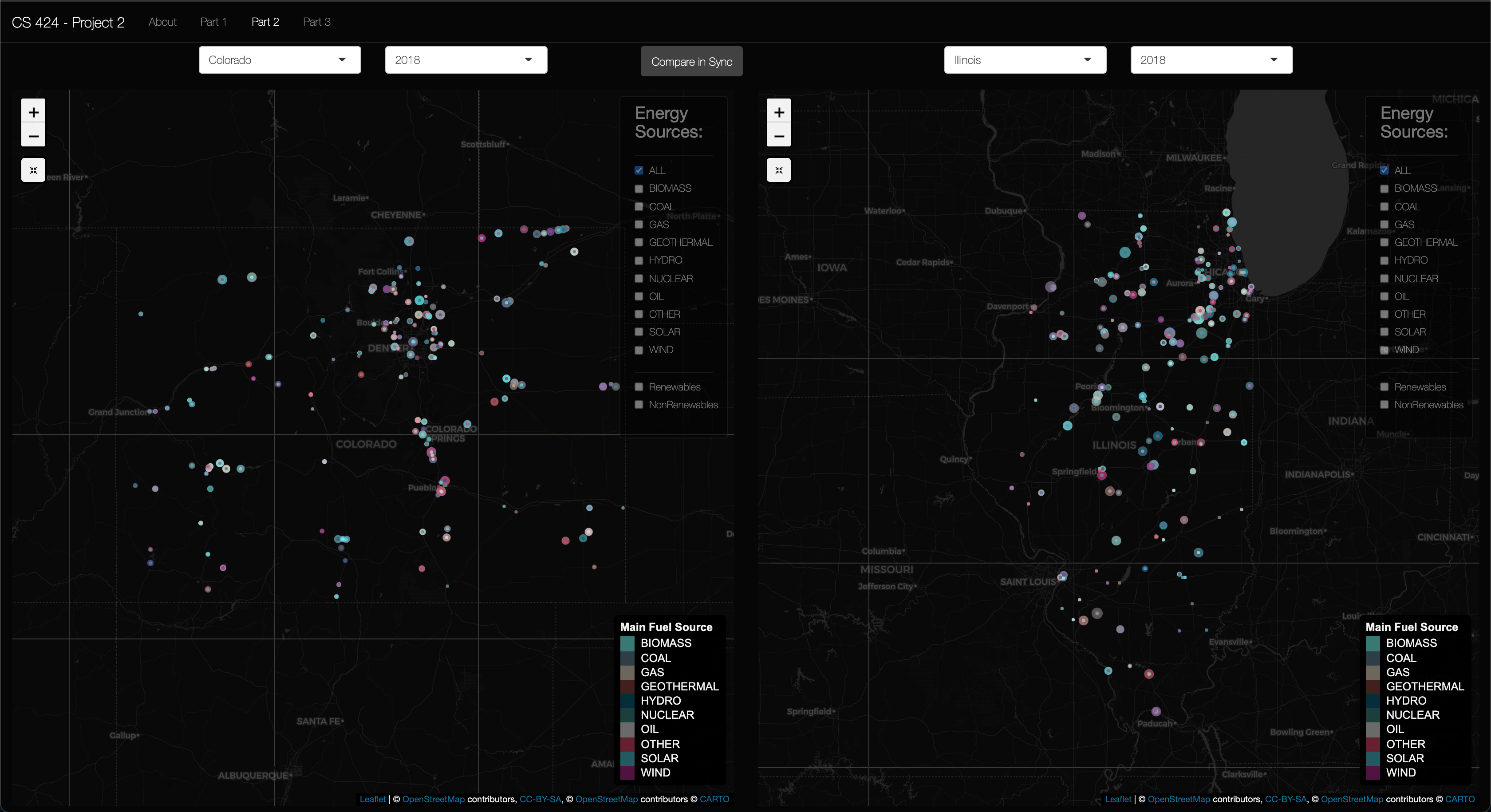
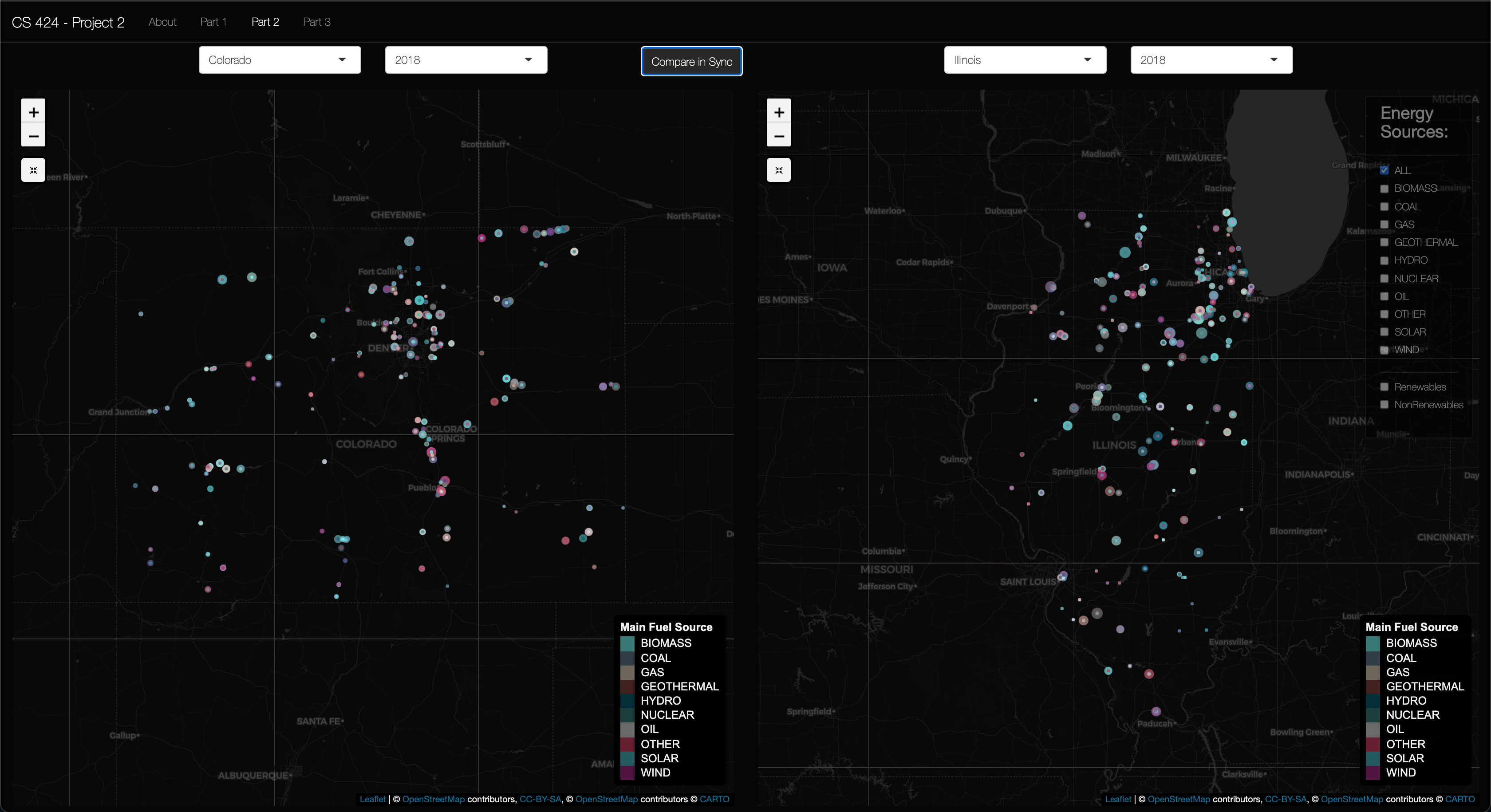
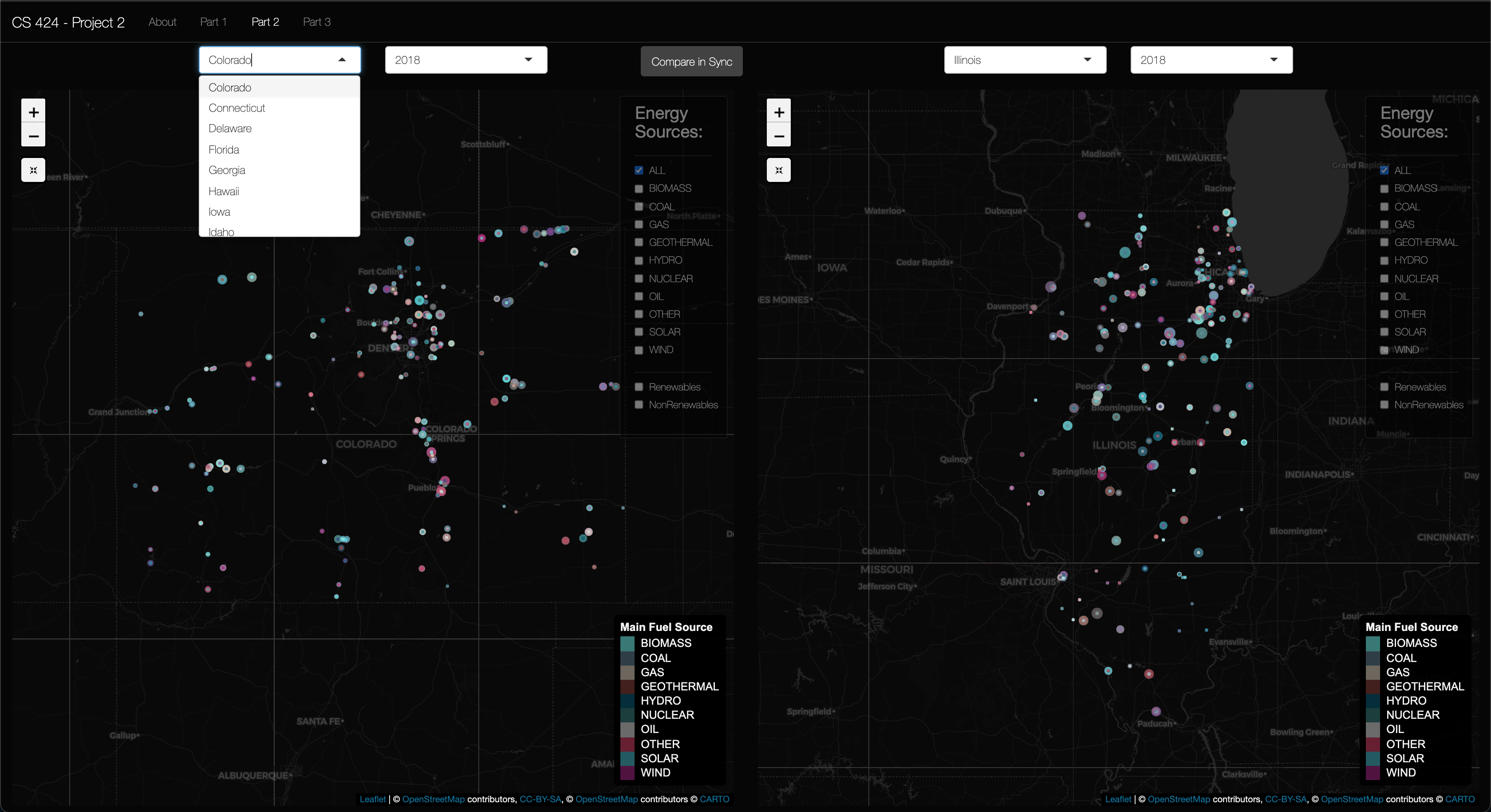
Viewing Objective 2: First click on the "Part 2" in the navigation bar. Once there, you should be able to see two map panes with state and year selectors above them. You should also see a sync button that hides the Left panes checkboxes and uses the Right pane's check boxes as input. These map panes have everything present and described in objective 1. The only addition is the 2 panes and the sync button. Now let's move on to part 3...
Viewing Objective 3: First click on the "Part 3" in the navigation bar. Once there, you should be able to see a single map zoomed out that shows the continentail US. You are also free to select what state to see and what year to view the data in. This map also have all the map features described in objective 1. So, with the tutorial complete spend some time investigating the data in either parts.
Bonus Content: To view the bonus content, click on the "About" tab in the left-side panel-tab. Here, you can see the credits/attributes for this project, and a another, but short, discription of the project.
Post Script: If you're interested in running the code yourself please click on the 1st link found at the botton of this page for the detailed description found on my GitHub Repository project page.
As mentioned above I got the data from epa.gov, and the link to the data set is at the bottom. I first download the "eGRID2018v2" XLSX file, then the eGRID Historical files. I comed trough the historical files until I found the egrid_2010_data xls file and the egrid_2000_plant xls file. All three years were modified to have idential number and names for the comumns, and redundant columns were removed to reduce the file sizes of each file. For the 2018 xlsx file I wrote an R script to calculate the percentages of the individual fuel sources and the net generation amount. I then used the script to calculate the net renewable/nonrenewable generations, and the percent renewable/nonrenewable of the total generation. For years 2000 and 2010 I used Microsoft Excell to manually do all the processing the R script did for the year 2018. I did this because 2000/2010 had most of the data I needed I just needed to calculate 1-2 columns, so it wouldn't be worth it to run a script to calculate the values of 2 columns.
If you want to use the data files for your own project, or if you want to just check out how I processed the files, you can go to my GithHub Project page, linked below, to download them. Just click on the data folder first or download the whole project to try it out for yourself.
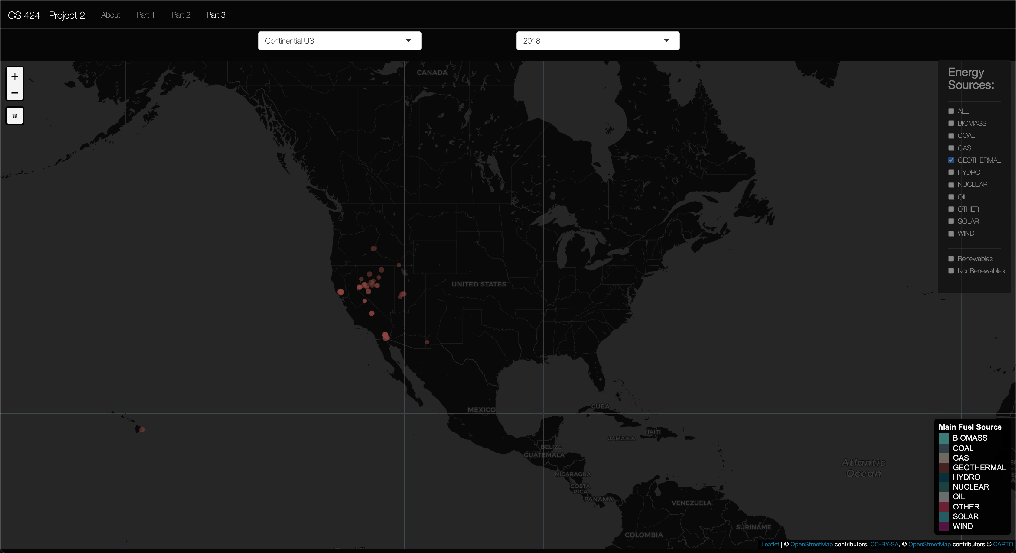
Insight 1: In the above picture you can see the Geothermal energy sourced plants that are used in the US. As you see these plants are concentrated to the West coast of the United States and in Hawaii. This makes sense as there are specific geologic events going on under these locations to provide the geothermal energy to produce the needed electricity for the people living in these locations. In fall 2019 I took EAES 111, and in this class we had a unit were we learned about the processes of plate techtonics. In this unit we learned about the different plate boundries (subduction, convergent, and translational), but we also learned how hotspots. And these are what facilitated geothermal energy to work in Hawaii and the West coast of the US. Hawaii is a hotspot valcano moving in the NE direction (hence the island arc), then then Southern California is near a transitional plate boundry, while northern California has a subduction zone. And, Yellowstone National Park is the result of 3 massive europtions of the Yellow Stone Caldera, a massive Super Volcano right here in the US. So, this is why it makes sense to be seeing geothermal in these parts of the US.
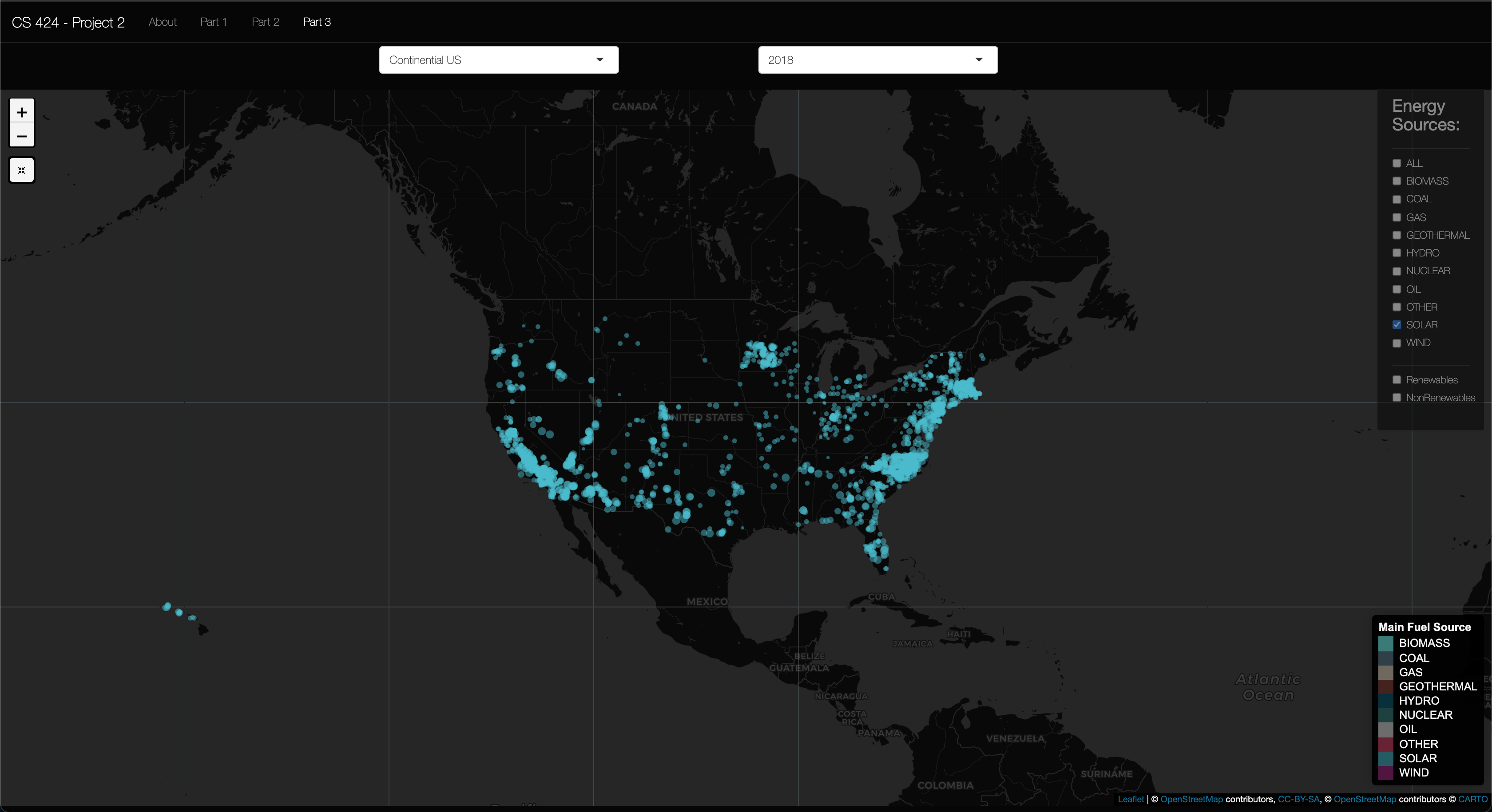
Insight 2: In the above picture you can see the Solar energy sourced plants that are used here in the US. It was to be expected that California was satruated with Solar plants (I assumed this as it a somewhat dry southern state), then solar plants were sparsly disperced around the US, but the East coast had a larger concentration. I also found it interesting that North Carolina, New Jersey, and Massachusetts had large concentration of solar plants then the sourounding states. I found this interesting as I assumed solar would make sence more in the sunnier dryer states then wetter states, so I'm assuming that the drive for these Solar plants could be attributed to either the "larger" populations found in these states when compared to other states in otehr regions in the US or the political pull of these states to go "green." To Conclude, I think more research is needed to look into how the placements of these solar farms compare to the sun coverage during different seasons.
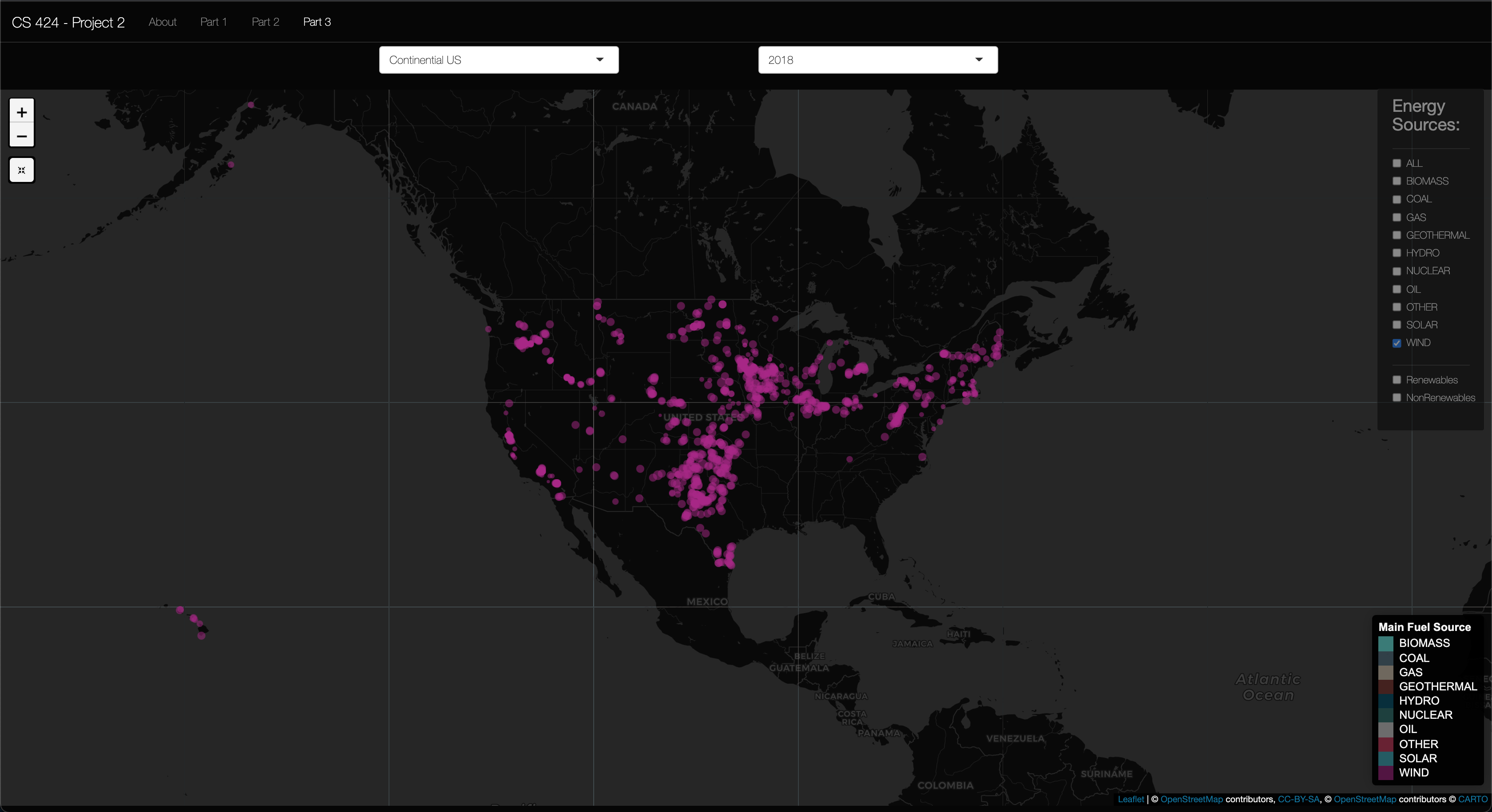
Insight 3: In the above picture you can see the Wind energy sourced plants that are used here in the US. I found it to be expected that the Great Plains region had the majority of wind farms as the great planes are vastly "flat" so in my mind they would serve as good candidates for wind farms as the wind would be unabstructed by tall trees, but then again most wind farms are much bigger than your average tree so that invalidates my claim a bit. I did however find it interesting that most of the Southwest states did not have wind farms to generate electricity. And I also found it interesting that that was a large concentration of wind farms in upper Texas and Oklahoma. It was interesting becuase of the Polar Vortex Texas suffered a few weeks ago, in 2021. So, it makes me wonder how different the situation could have been in Tesax if they had meens of staring this wind energy by way of the Tesla Mega-Battery or other means. To Conclude, I think more research is needed to look into how the placements of these wind turbines compare to the wind patterns of different seasons in the US.
1st link: this will lead you to my GitHub Repository for this project.
2nd link: this will lead you to the homepage for the unprocessed dataset used for this project.
3rd link: this will lead you to the ShinyApps.io dashboard I made to visualize the dataset.
4th link: this will lead you to a YouTube narriated walkthrough of how to use the ShinyApps.io dashboard.
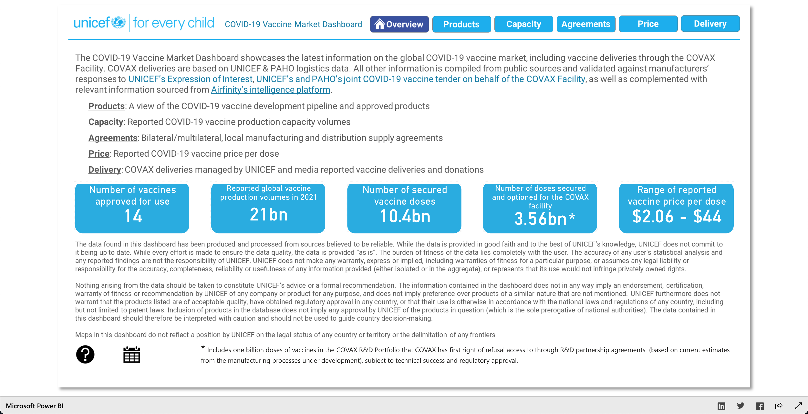
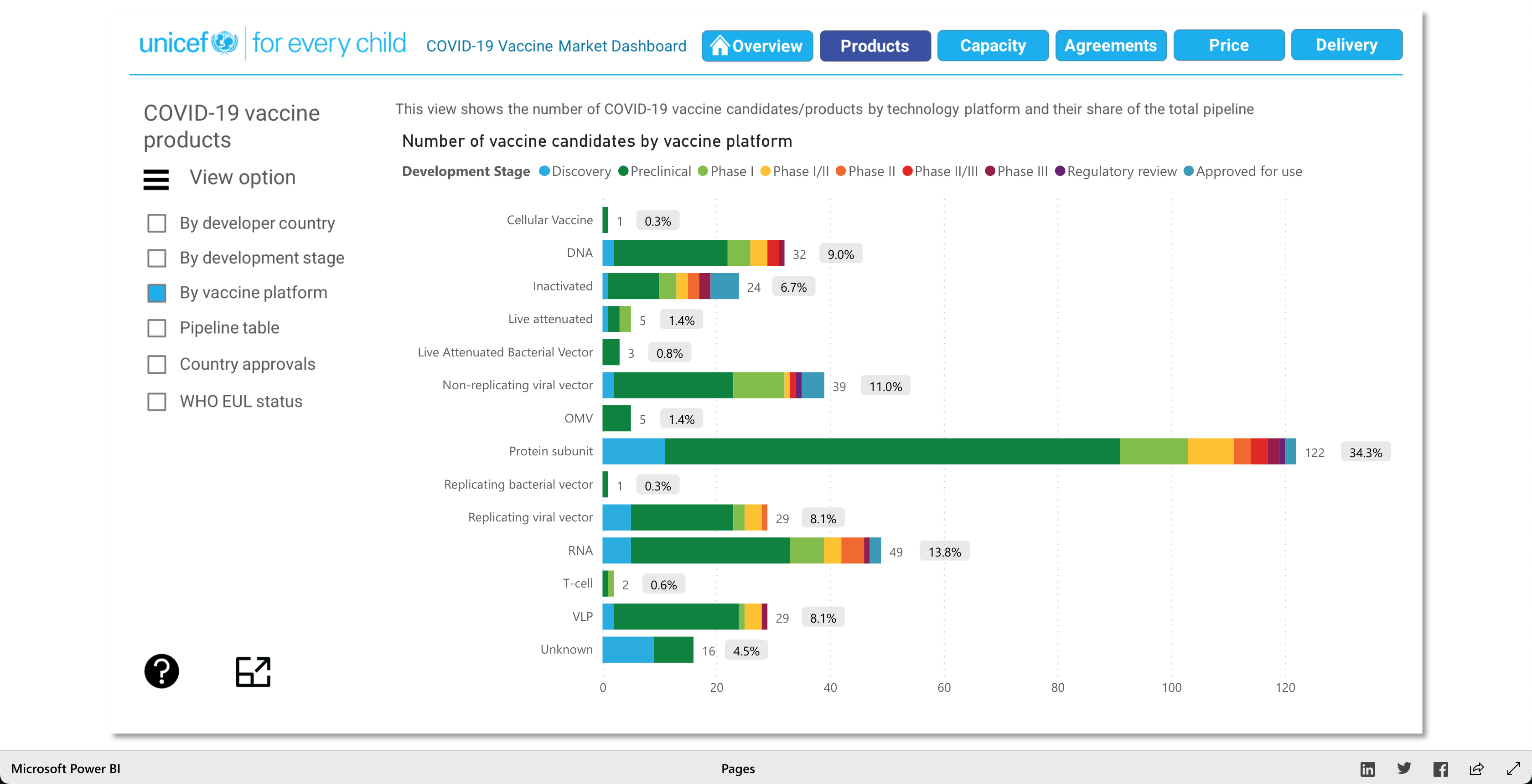
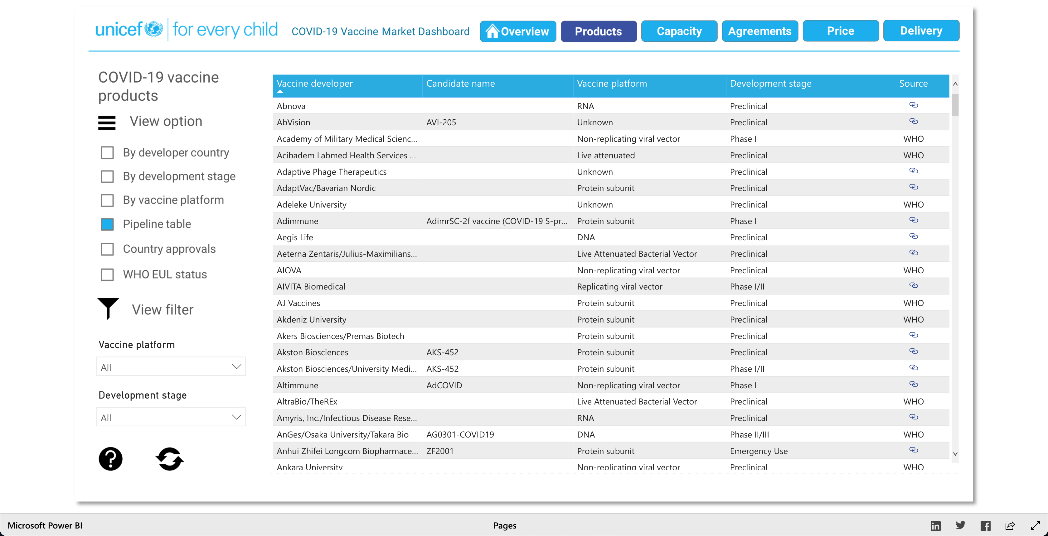
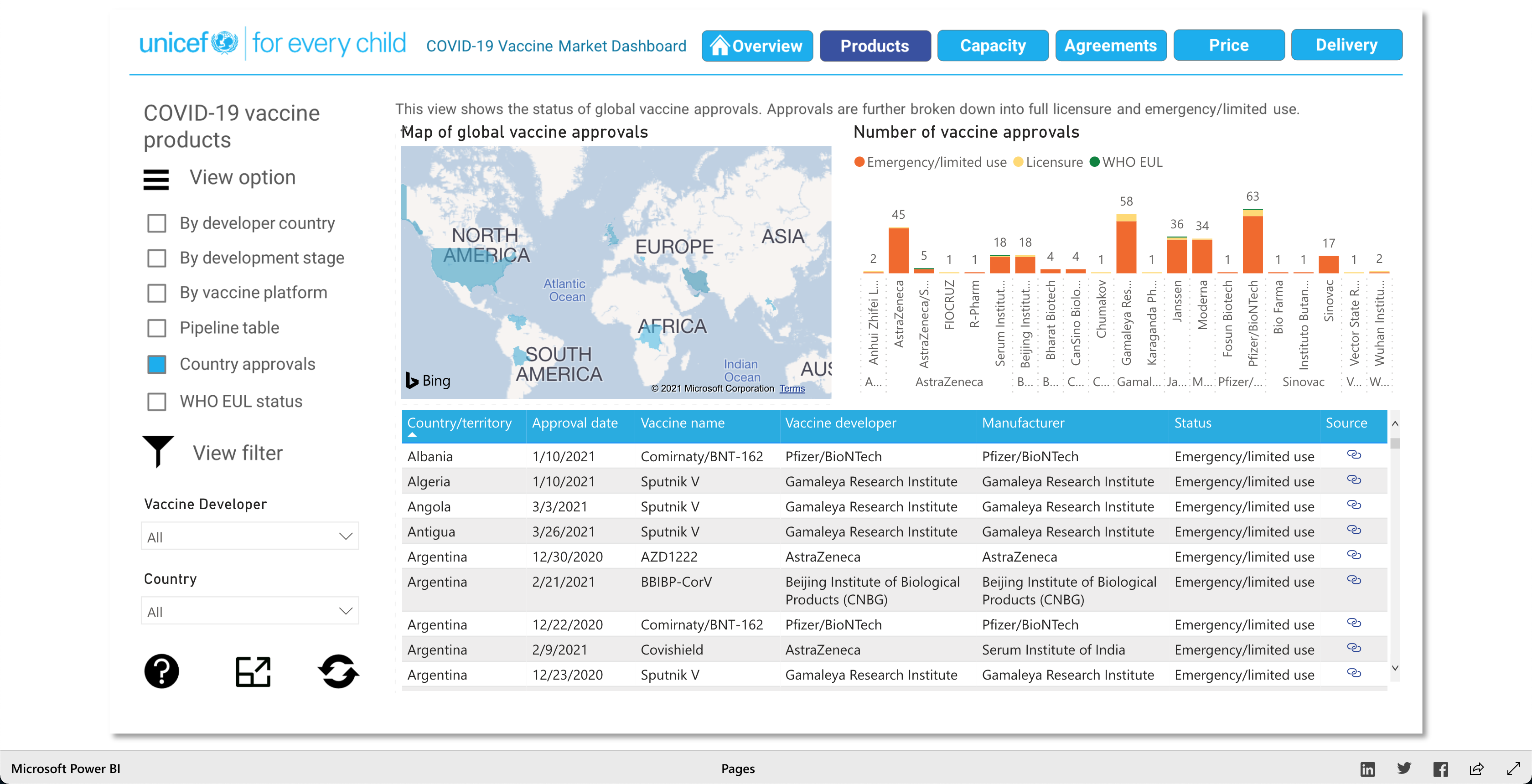
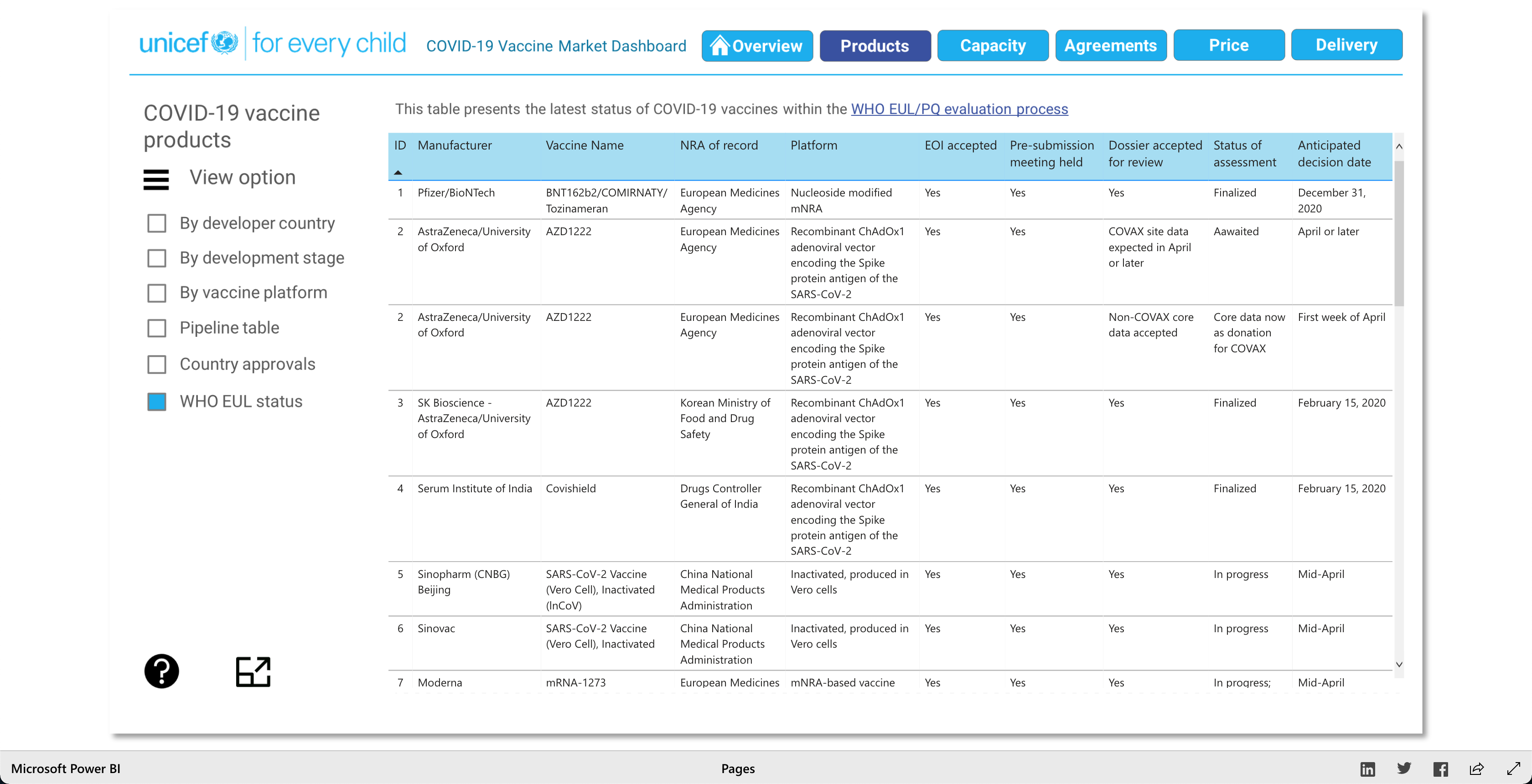
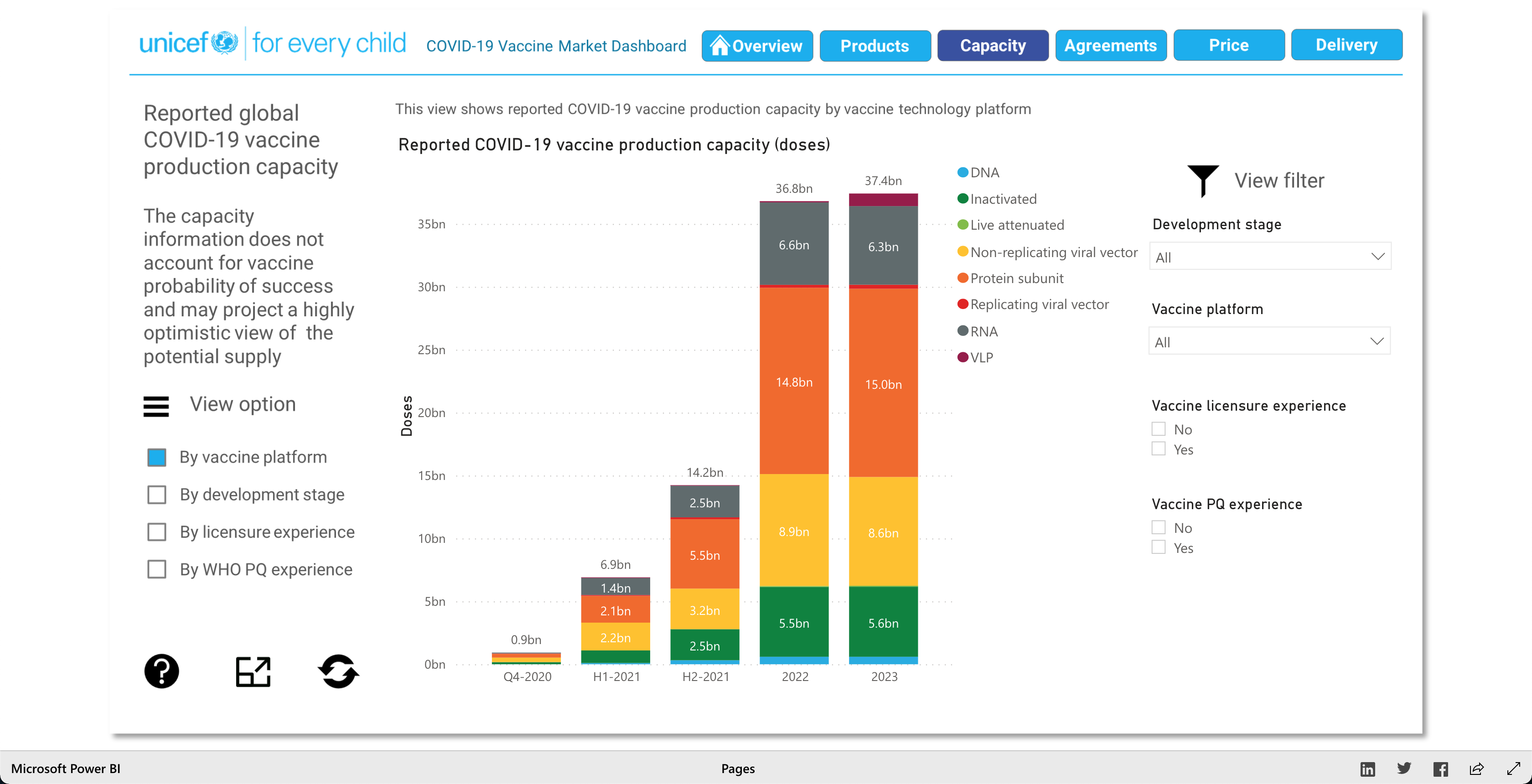
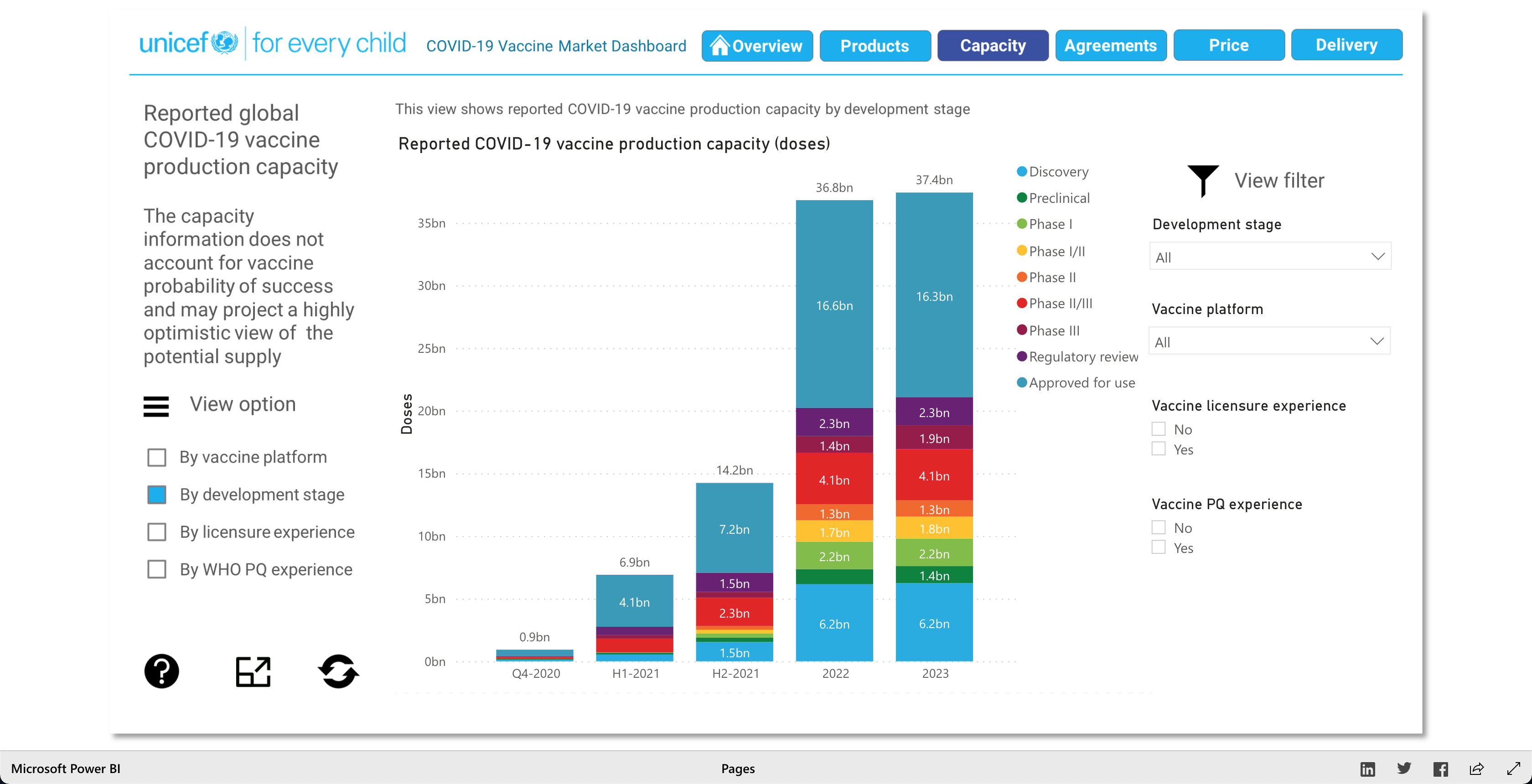
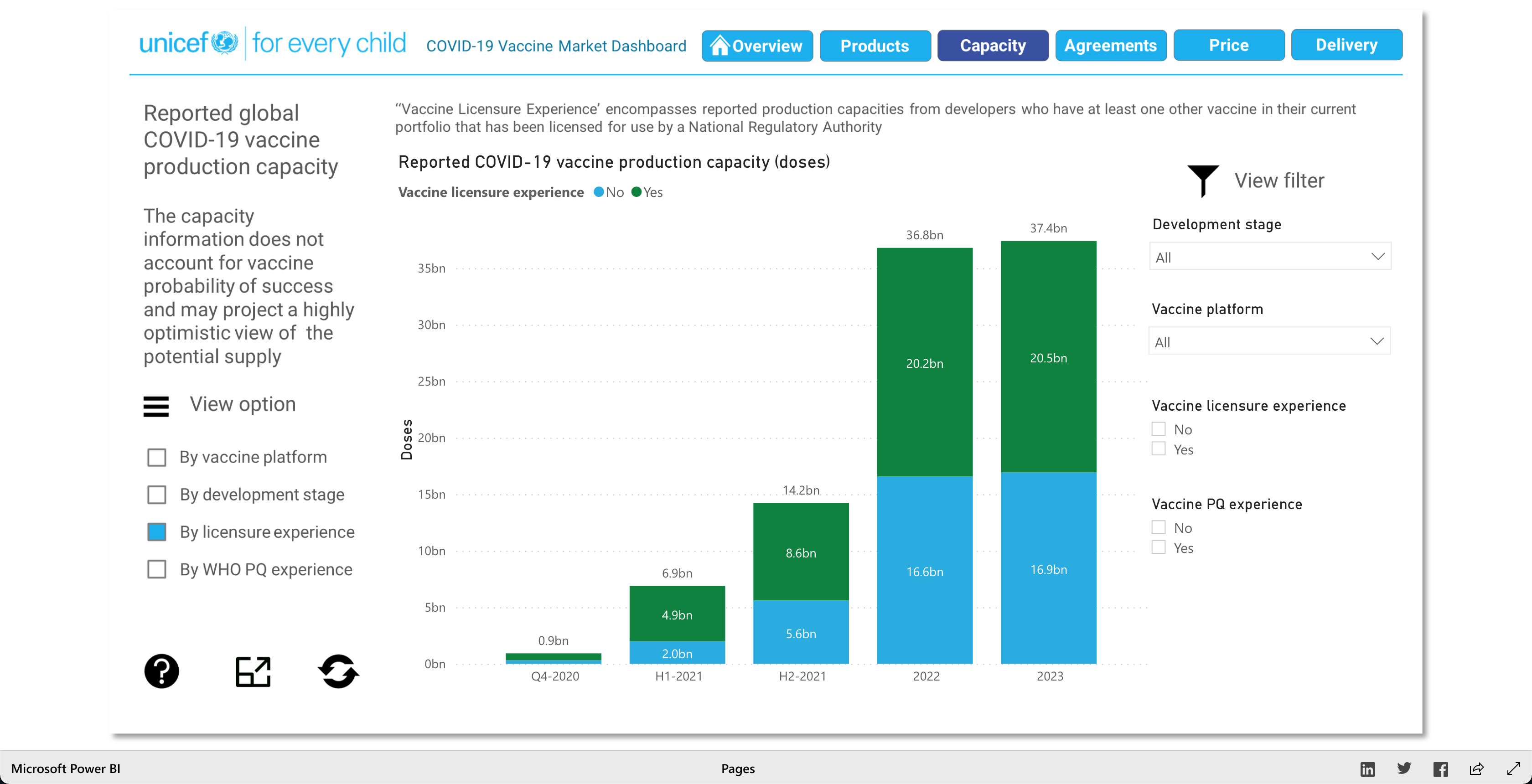
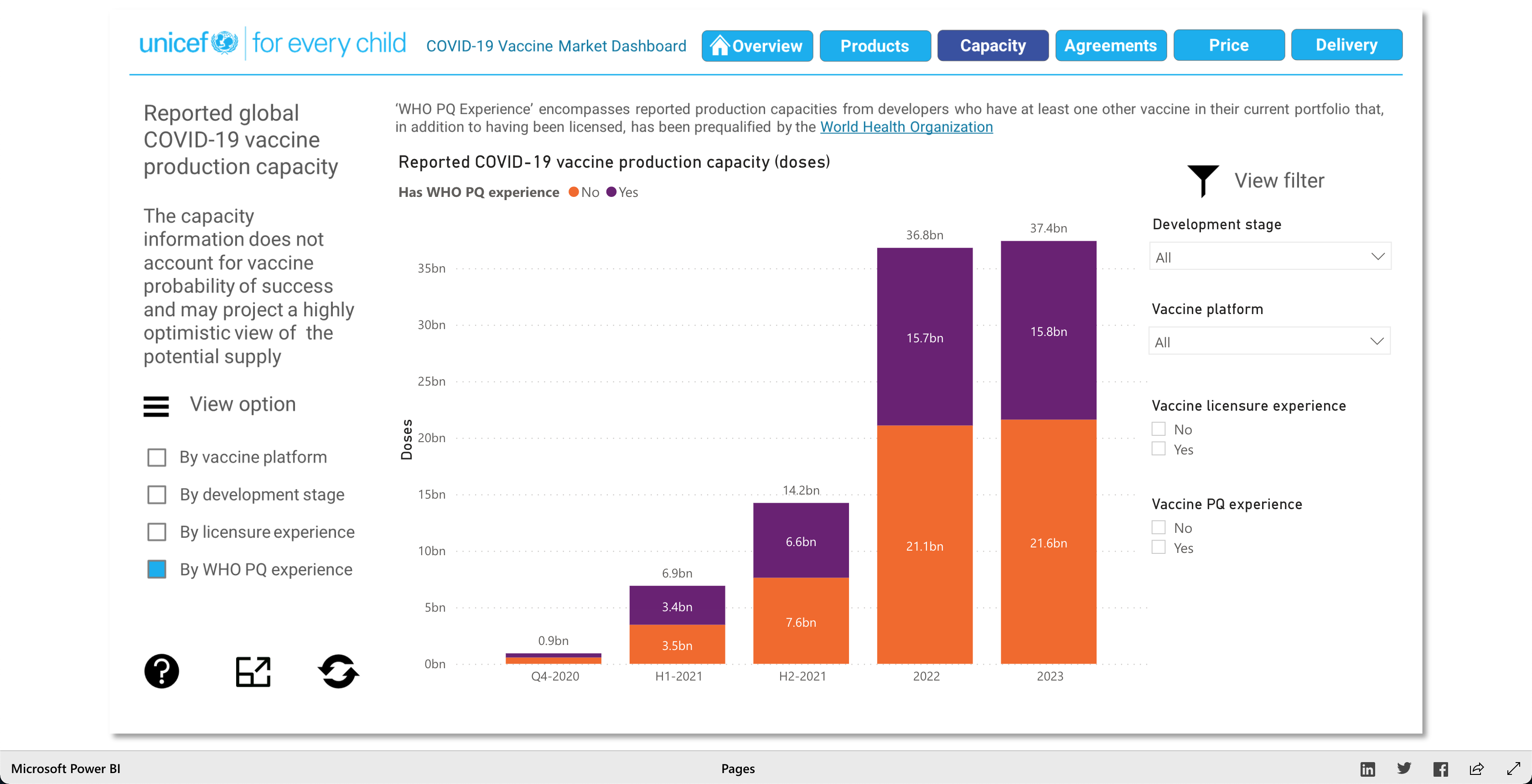
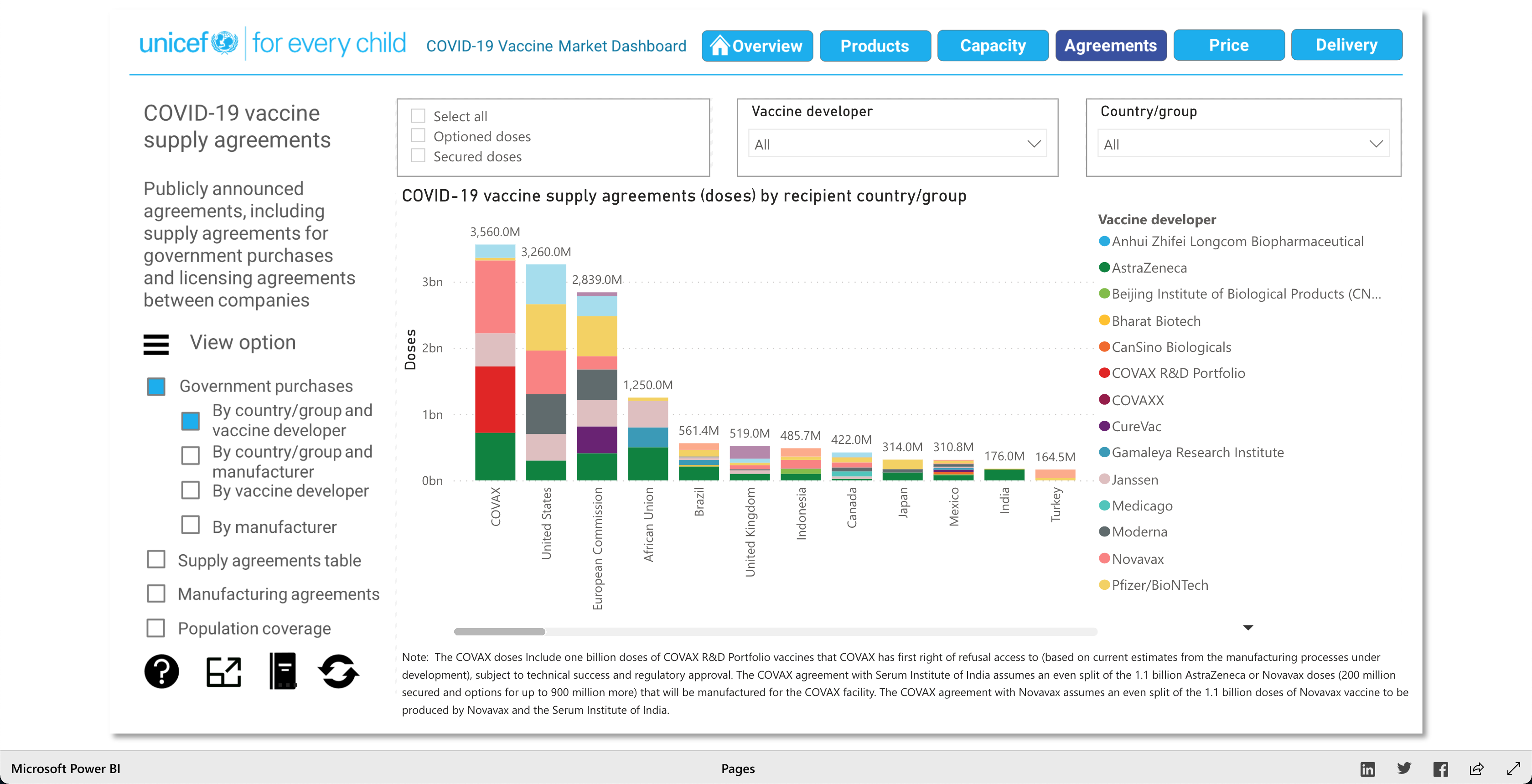
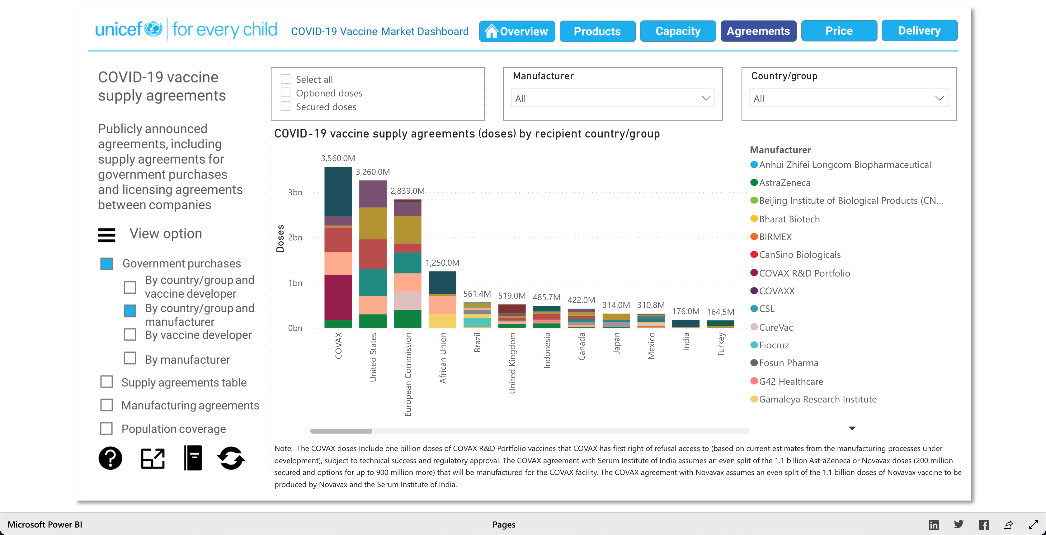
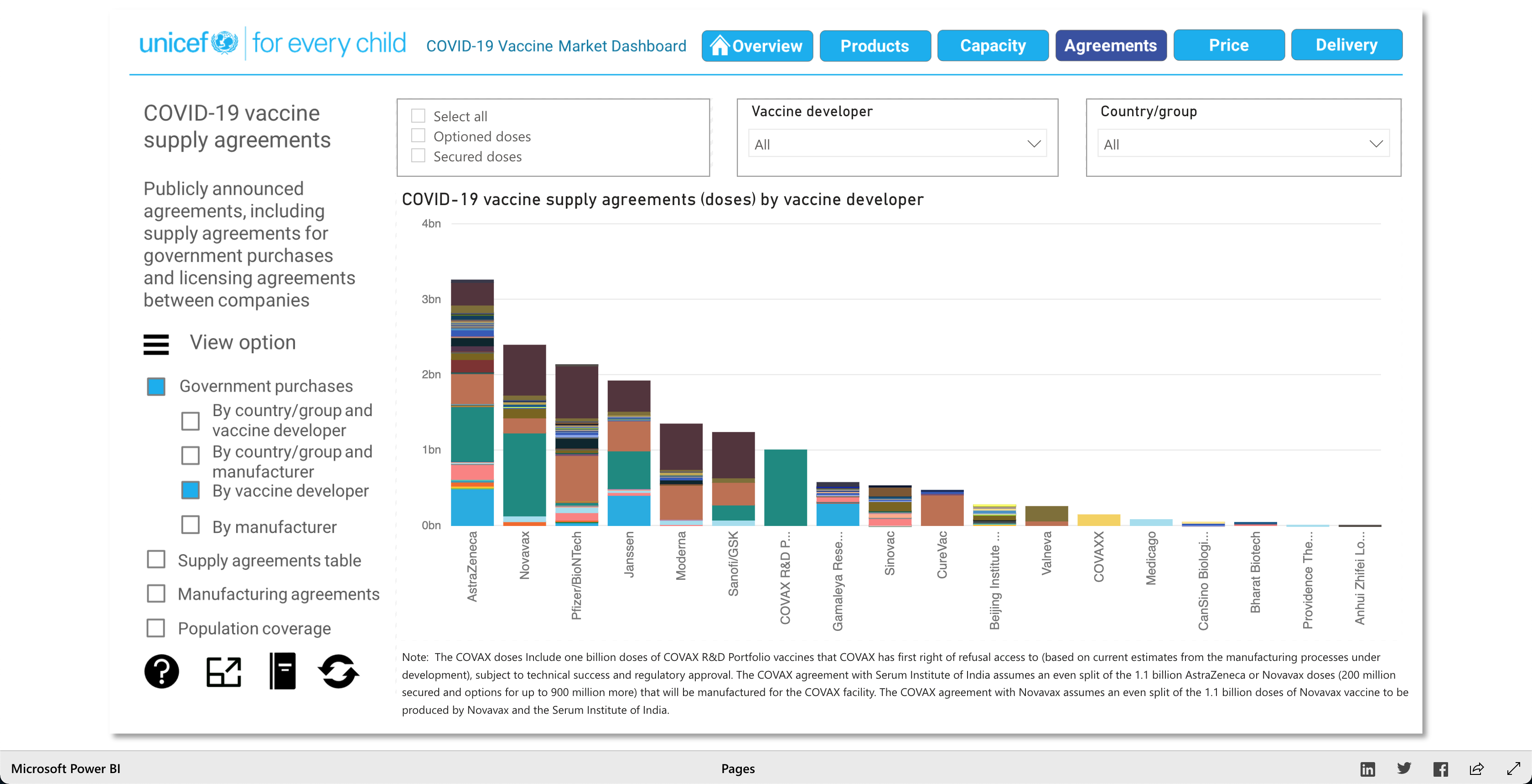
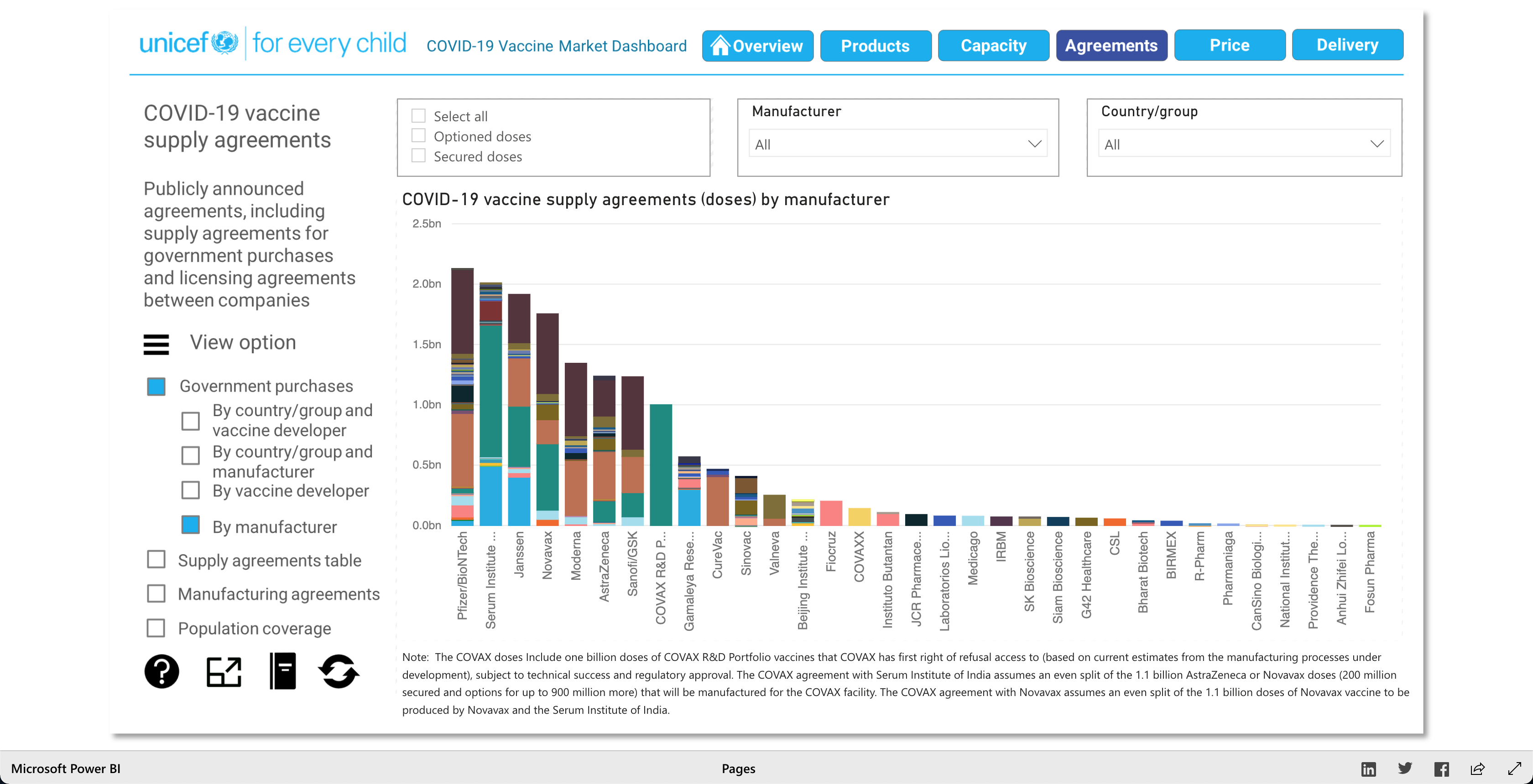
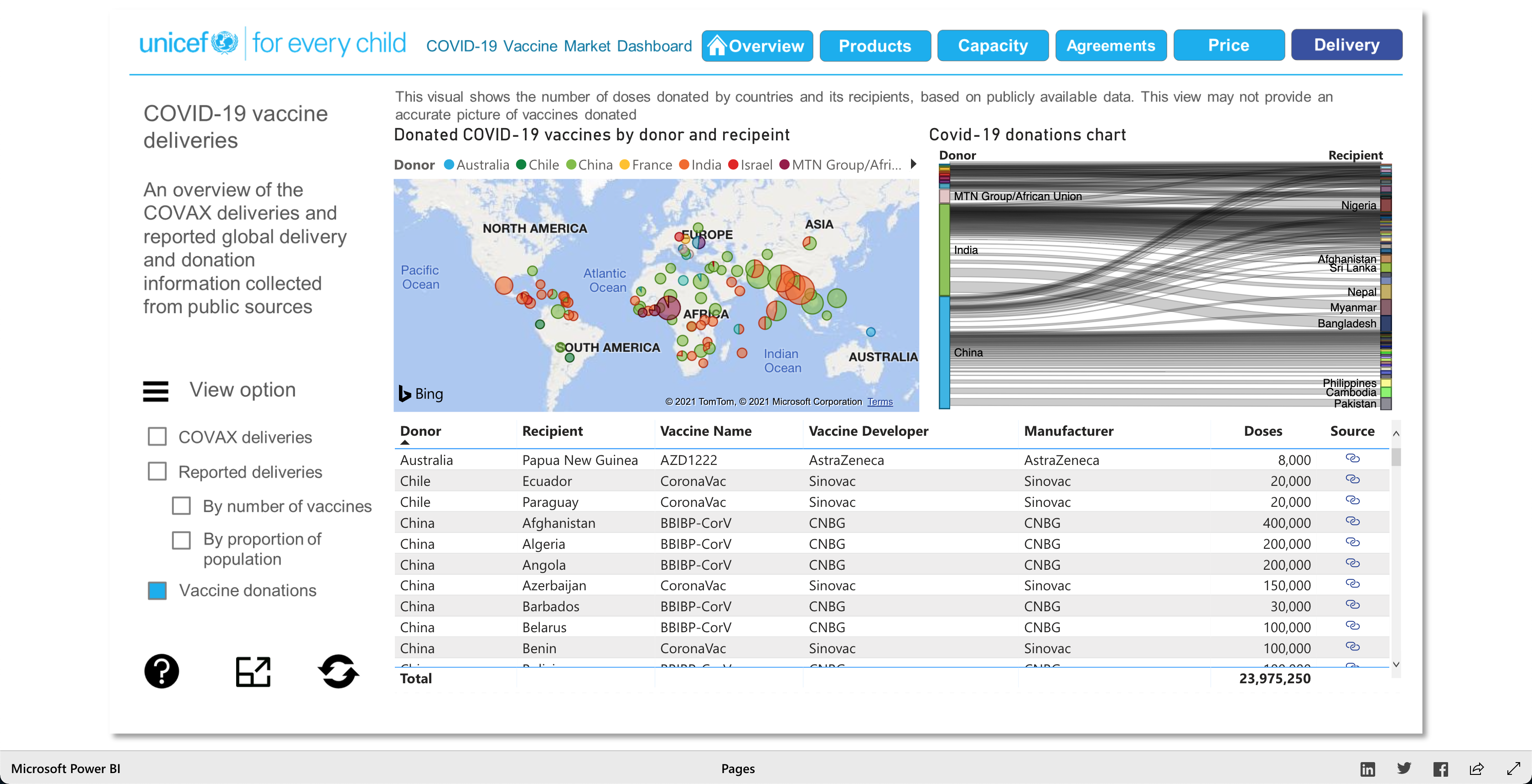
The purpose of this visualization, according to unicef.org, is to "[showcase] the latest information on the global COVID-19 vaccine market, including deliveries through the COVAX Facility" (2021). What this means, is that this visualization is trying to showcase the progress of the vaccination initiative around the world. And it's broken down into 5 main visuals: Products, Capacity, Agreements, Price, and Delivery.
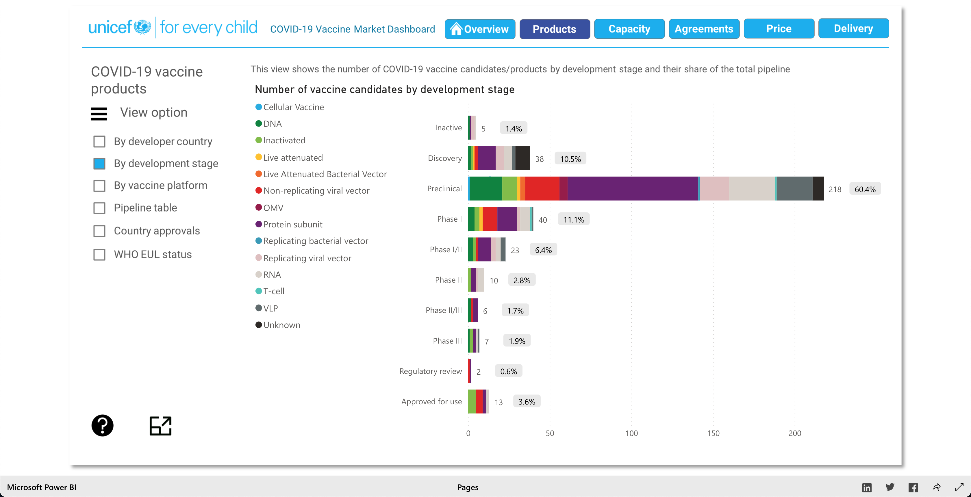
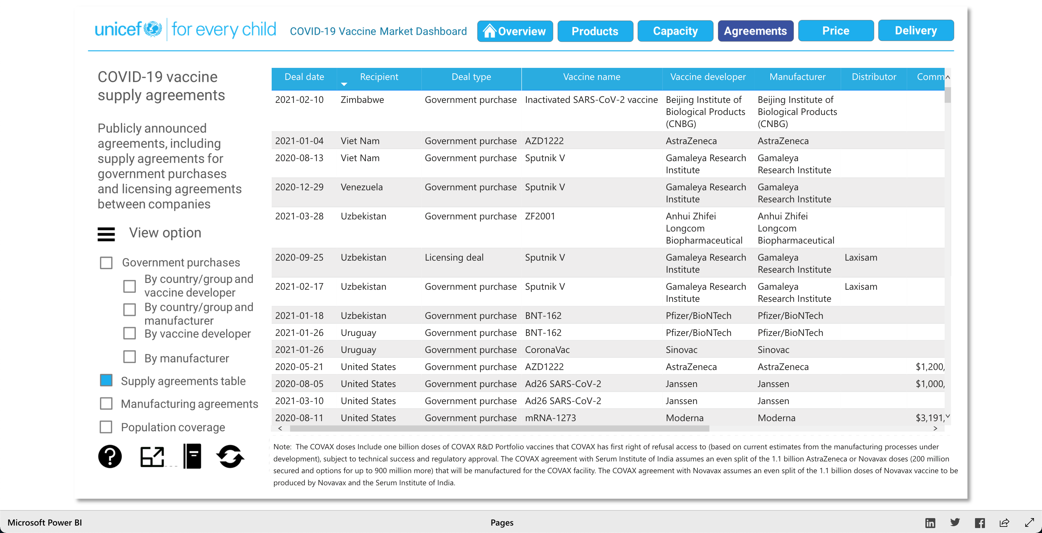
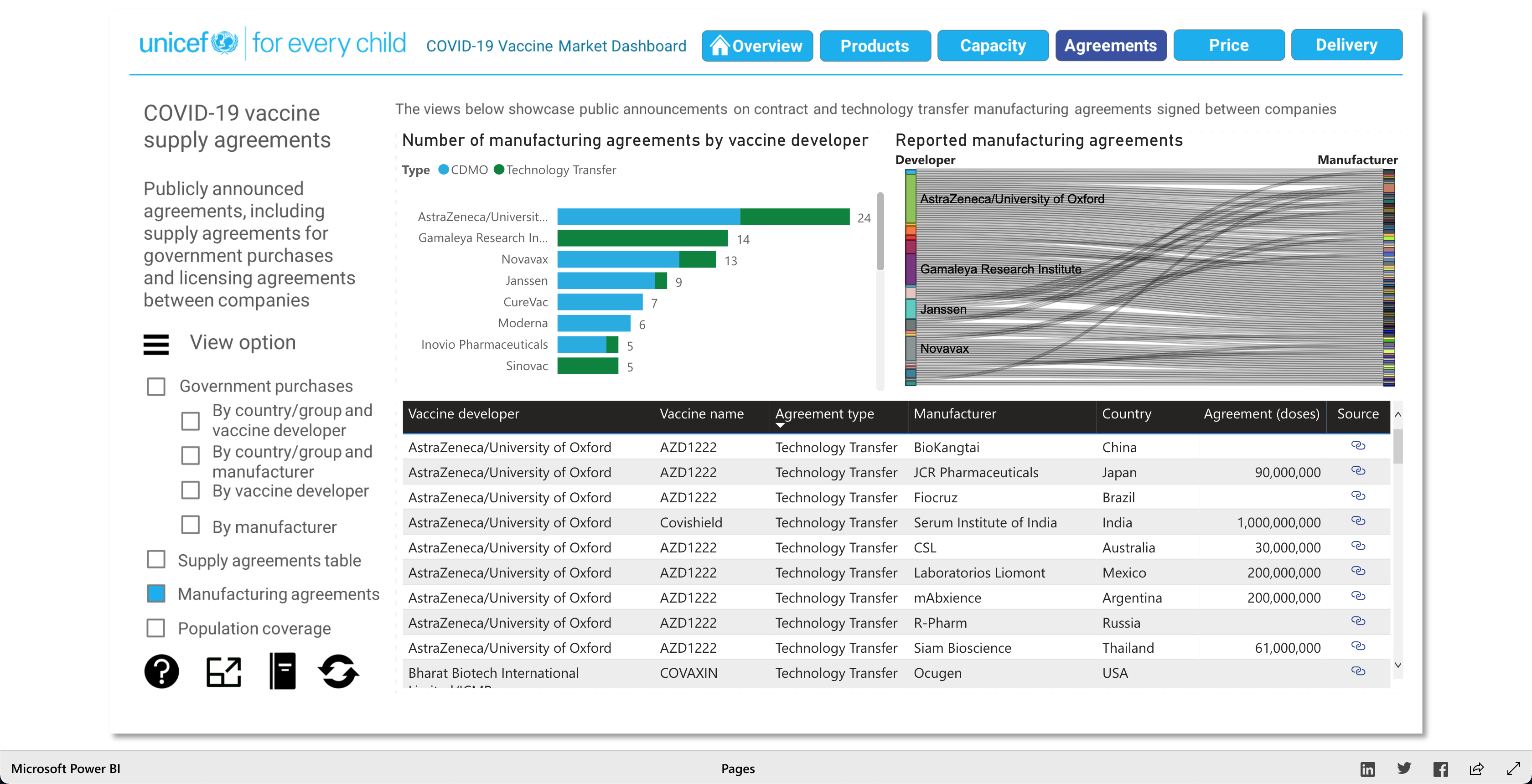
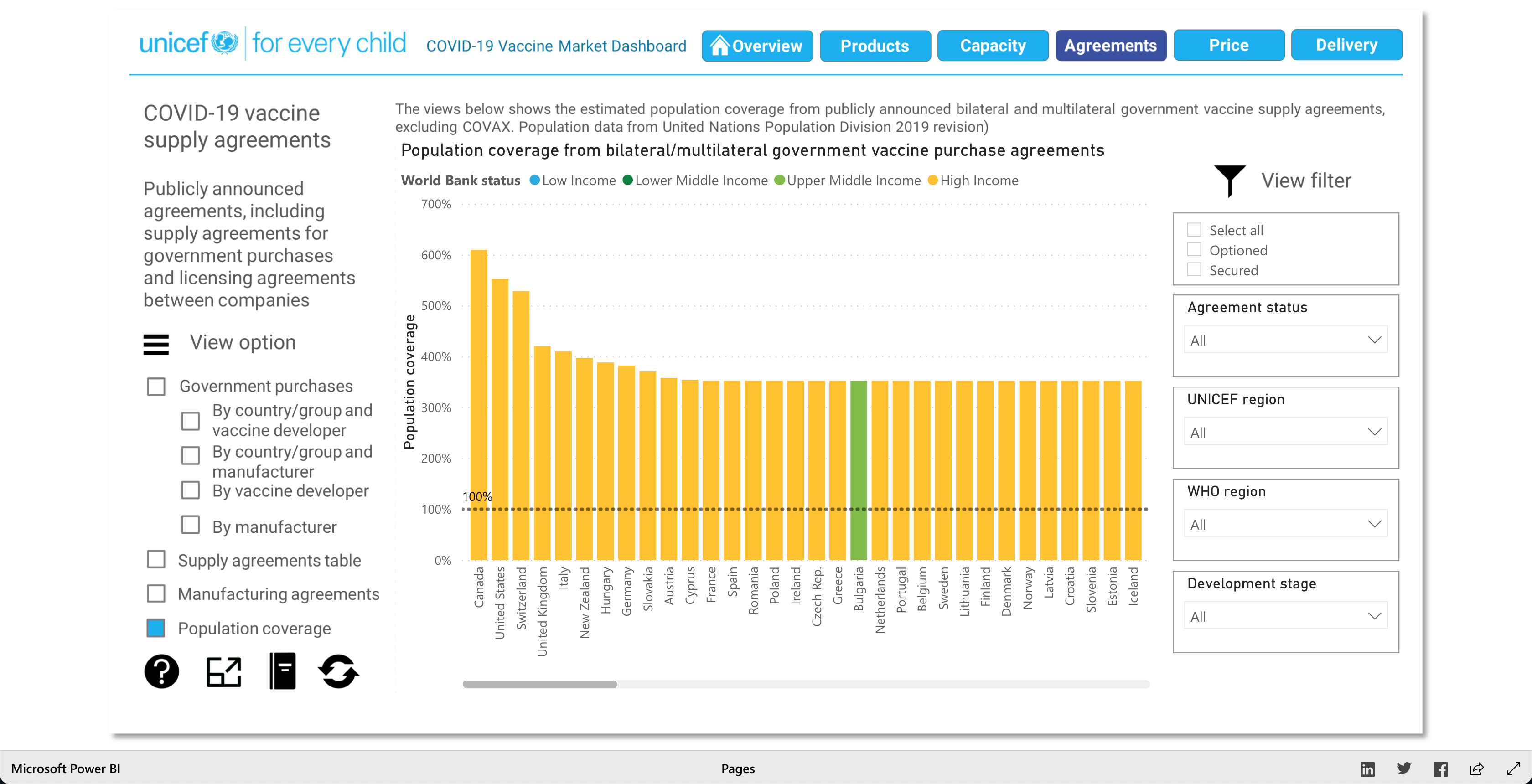
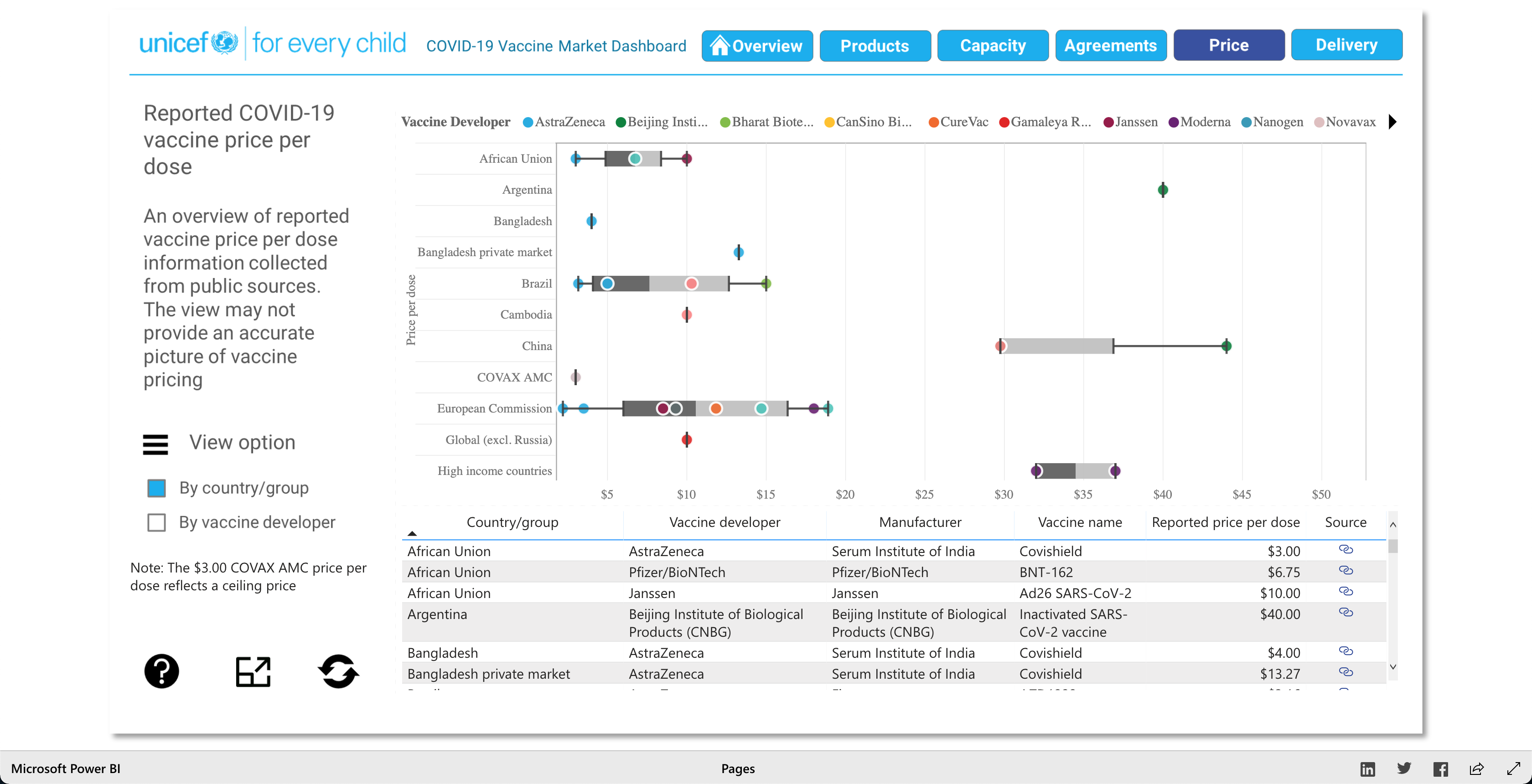
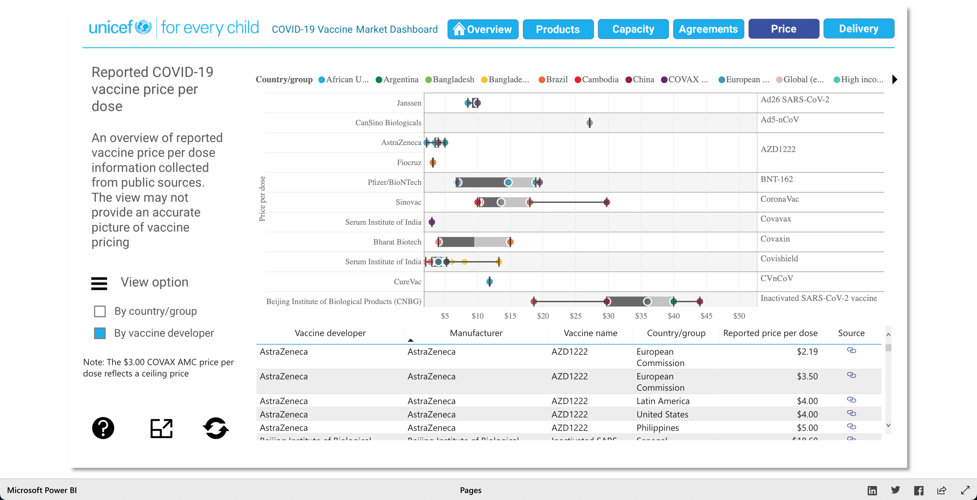
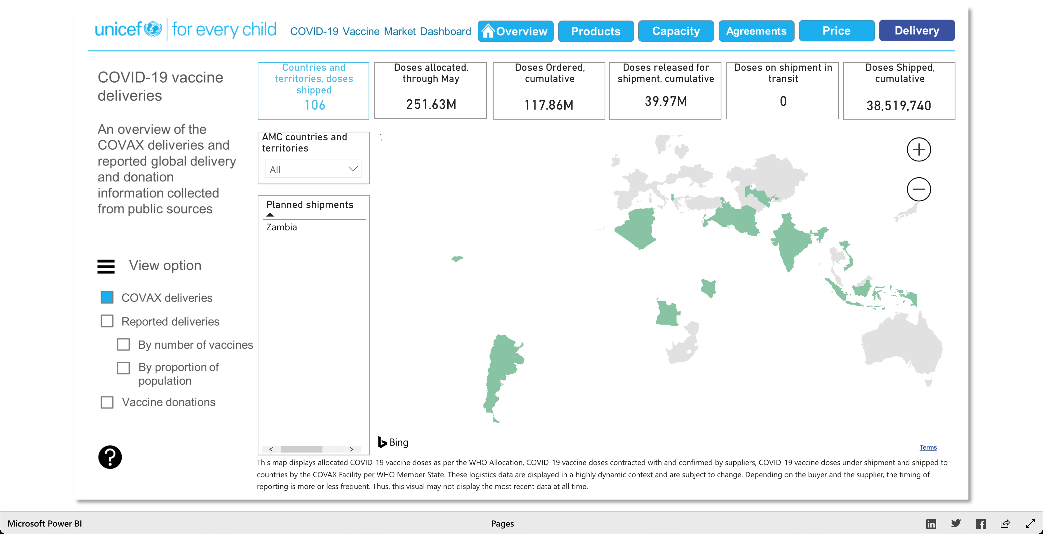
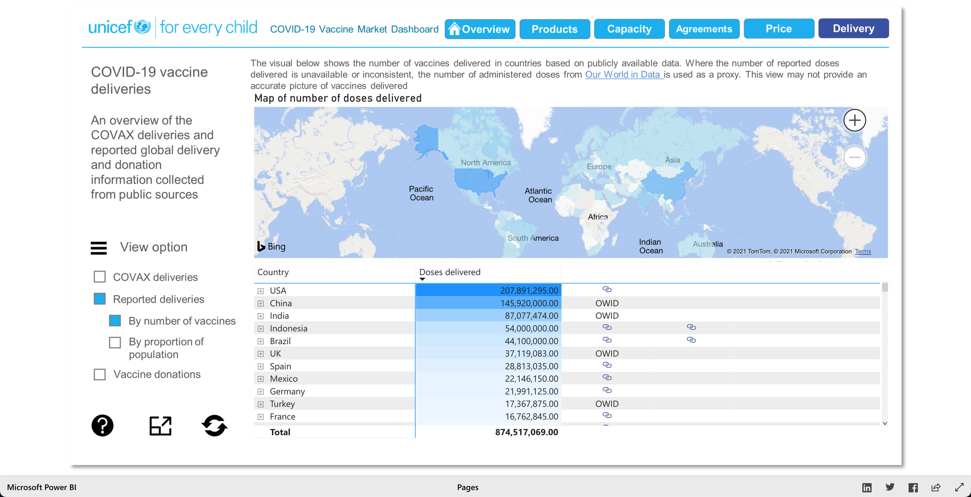
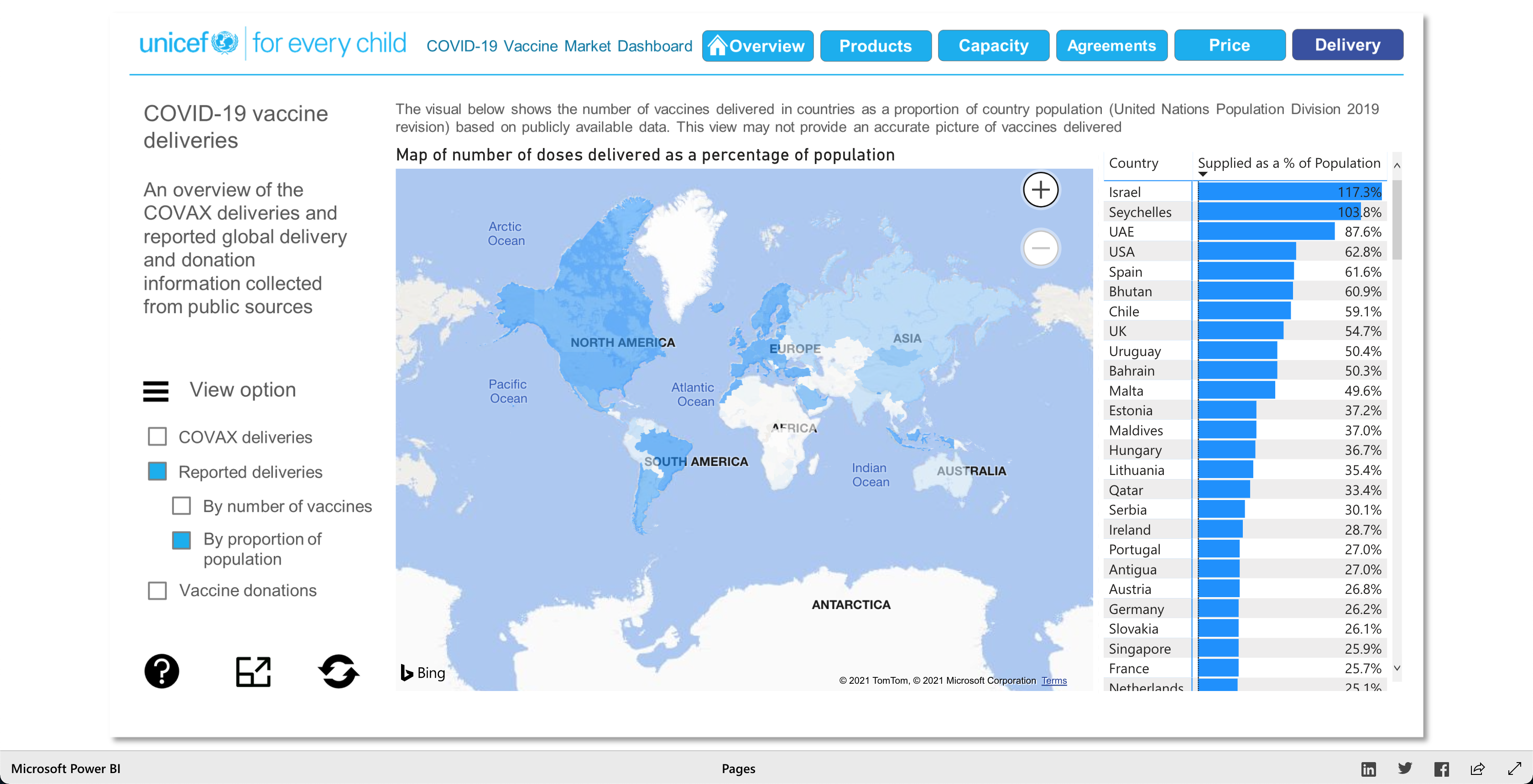
The Products visualization shows the many vaccines' "development pipelines and approved products." The Capacity visualization shows the "Reported [...] vaccine production capacity volumes." The Agreements visualization shows "Bilateral/multilateral, local manufacturing and distribution supply agreements." The Price visualization shows the vaccine dosage price. And finally, the Delivery visualization shows the "COVAX deliveries managed by UNICEF and media reported vaccine deliveries and donations." To summarize, these visualizations together help paint a better picture into how the vaccination initiative is going on around the world.
The COVAX Deliveries data is based on the "UNICEF & PAHO logistics data." Then some data was compiled from public sources and validated under specific UNICEF & PAHO terms (linked in the visualization). And some more data was sourced from the Airfinity Intelligence Platform (link in visualization).
To add and according to UNICEF, the data for these visualizations was obtained from sources "believed to be reliable." UNICEF also states that to the best of their knowledge the data was provided under good faith, and though they tried to maintain data quality, the data was provided "as is." So, it's up to the user to determine the final validity of the data and conduct their own analysis, according to UNICEF.
The users of this data can literally be anyone, from private citizens to government politicians. It truly is meant for anyone interested in gaining knowledge on how the vaccination initiative is doing around the world. Private citizens can see how different countries compare or how different vaccines compare to, so that they can become more educated on the topic. While, the politicians of countries can use this data, though with some grain of salts, to make public policies relating to the vaccination efforts of their home countries or to gain assistance or be assistance to other countries.
People can ask any questions related to the COVID-19 vaccine. But I think the most asked questions have been: How many vaccines are approved for use? What are the global production volumes of the vaccines in 2021? What is the number of secured vaccine doses? What is the number of vaccine doses secured for the COVAX facility use? What's the general cost of vaccine doses? I concluded these as the "FAQs" because the overview dashboard showcases these as the 5 most eye-catching data points as they are white text on light blue background, so they pop out from the rest of the main dashboard page. However, users can ask other questions such as what countries are developing vaccines? What countries are using vaccines from other countries? What vaccines are most used? Etc. The possible questions that users could be asking are "endless" as long as they relate to COVID-19 vaccinations.
As described earlier, there are 5 main visuals: Products, Capacity, Agreements, Price, and Delivery, and each visual has different was of interacting with the data for that said category. The user can select different radio buttons to choose different data filters. The visuals use stacked bar charts (horizontal and vertical), tables (to show the raw data), and candle stick charts, to portray the data in different ways. Though the user can't specify what visualization method (s)he would like to see for the different categories, as they are fixed visualizations, the user can pick and choose different filters to view different aspects of the data in the different categories. The user can also, click on any data point/box and the visualization with focus on it as well as pop-up more information on the clicked element. So, each of the 5 categories has a solid visualization to many COVID-19 vaccinations questions any user might have, as the visualizations are easy to understand and easy to navigate.
Everything works from a functional perspective. All the data loads properly, though on very rare occasions there might be some hiccups in displaying the data. (i.e., on the main dashboard, the 5 blue boxes might sometimes show information that's cut off or miss formatted.) The color stays consistent for the same data variables in different visualizations, or as the user selects different filters, so the user won't get confused with randomly colored variables/fields. The user can click on different countries on a map or different categories in the legends to focus on them.
Most of the visuals load within 5 seconds (but this is still slow, considering my standards). The Delivery tab has the slowest loading/rendering of visuals, and my Dual Core MacBook Pro from 2015 starts to ramp up its fans because it's starting to BURN. So, the Delivery tab's visuals need to be better optimized, but I don't know if it's only my computer issue or if other users might have the same issue. And I can't really imagine running this visualization on a Chrome book. I also think that the rendering/loading when a new tab is clicked can be done better as some of the previous tab’s information is present and underlaid the current new tabs loading information. The whole visualization has no vertical scroll, but some visuals have vertical and/or horizontal scroll. From what I've learned in my CS 424 class this is not good, so it should be fixed. I also learned that choosing a correct color palette is important as part of the human population is color blind, so adding color blind friendly colors would be needed. I also tried to see if the Visualizations would be localized (both language and measurement unit wise), but it wasn't. So, I would also suggest localizing the data, because not everyone can read English, plus it'd be a great benefit if the data/graphs/information was localized, so that everyone could be able to understand the data.
Overall, I really like this visualization for the COVID-19 Vaccine Market Dashboard. There was a lot of information packed into the visualization, though it felt overwhelming at first, after a couple of minutes I was able to settle down and observe/analyze what was going on around the world regarding the COVID-19 vaccination initiative.

Note: Watch the Youtube Video (linked below) to descover more about the Visualization!
1st link: this will lead you to the UNICEF.org COVID-19 Vaccine Market Dashboard page.
2nd link: this will lead you to the the actual visualization.
3rd link: this will lead you to a YouTube narriated walkthrough/criteque of the visualization.